 design-infra
Component catalog
Find components by type and feeling. Explore live examples, shortlist your options, and copy your picks to your agent.
Filter by feeling, motion, usage or library · 1 active
807 total results · 777 with visual previews · 30 on source sites
- Interactive demo · switch to Live view
Temporary page an agent installs in a consumer project to render candidate variants of the user's own component side by side, with their theme and content: <DesignLab title> + <LabOption id label notes chosen>. Lands at app/design-lab/page.tsx + components/design-lab.tsx; the user says which option they want, the agent applies it and removes both files.
 hover — subtle
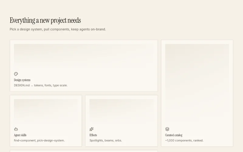
Theme-aware bento grid for feature sections. Tiles span 1, 2 or a full row; hover glow uses --primary.
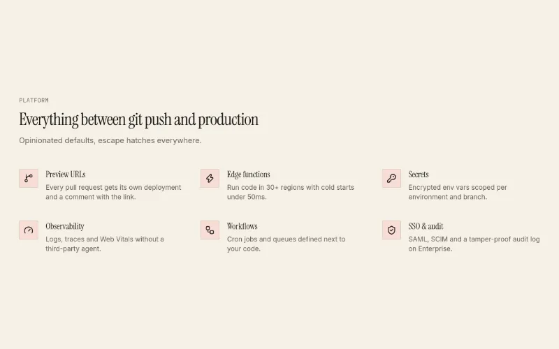
Icon + title + text feature rows in a 2- or 3-column grid, or heading-left/list-right with columns={1}. Calmer alternative to feature-bento.
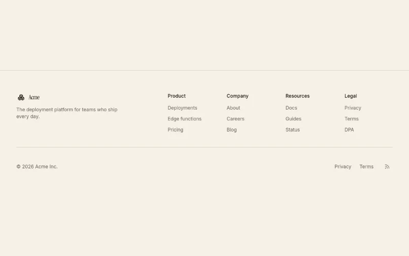
Site footer: brand + blurb, 2-5 link columns, bottom bar with copyright, legal links and social icons.
 loop · hover — subtle
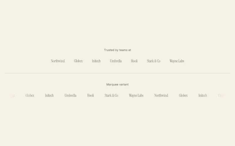
'Trusted by' strip. Static wrapping row or infinite marquee with faded edges (pauses on hover, respects reduced motion). Text wordmarks when no SVG is given.
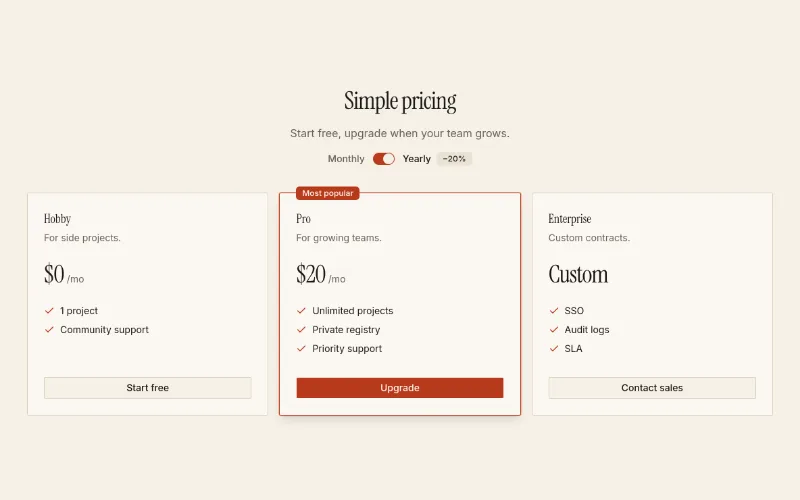
2–3 tier pricing with monthly/yearly switch and a featured tier. Pure shadcn primitives + tokens.
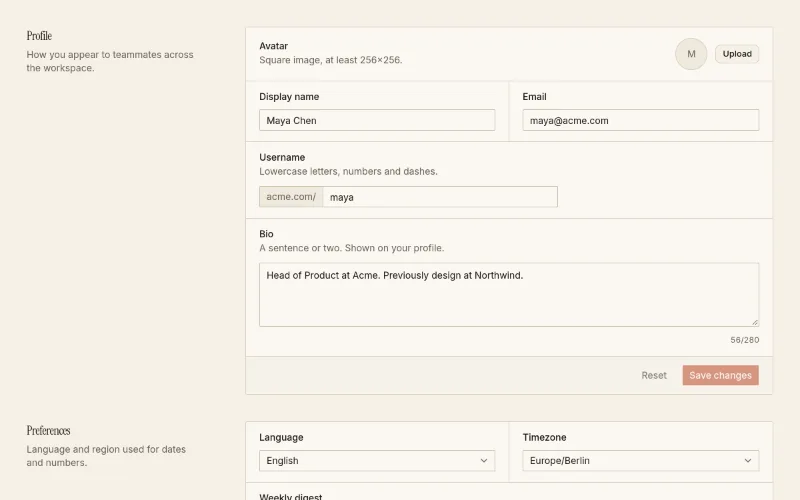
Account settings page (profile, preferences, notifications, danger zone) plus the SettingsSection / SettingsRow primitives to compose your own.
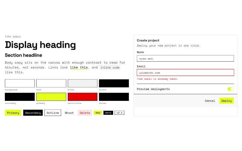
Writes DESIGN.md to the project root + theme tokens + fonts. Read design-systems/brutalist-mono/DESIGN.md first.
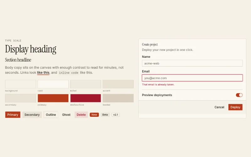
Kitchen-sink of the installed theme (swatches, type, buttons, form card). Install after a theme to eyeball it.
 enter — subtle
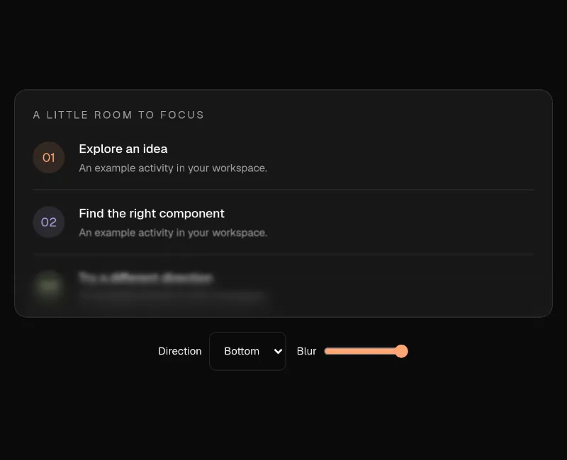
♥ The user wants more interesting live homepage examples and shared this surface effect. Show it over a scrollable UI with readable controls outside the blur; it is a static surface effect, not a loading animation. — Layered CSS backdrop blur for fading scroll-container edges and decorative surfaces. It is not a loader or a continuous animation. Keep text, focus targets and controls outside the strongest blur; the decorative overlay must not intercept interaction. Hosted demo includes a real scroll container and blur controls.
 hover · state — subtle
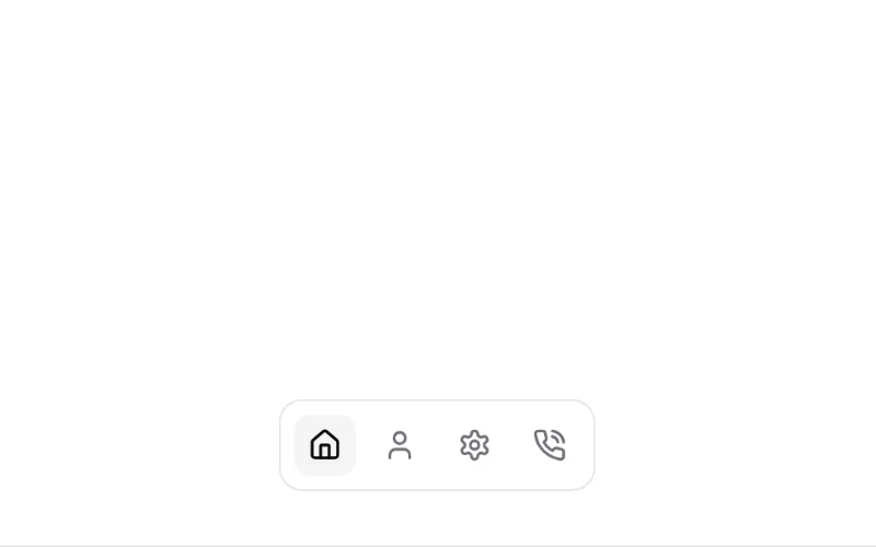
Sliding highlight behind the hovered/active item (tabs, nav, segmented controls). You pass the bg class (e.g. bg-muted), so it follows the theme.
 enter — subtle
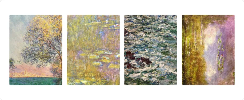
Stagger a group of children with presets (fade, blur, slide, zoom…). Colourless; good for feature lists and logo rows.
 enter — subtle
 loop · hover — medium
Infinite marquee with speedOnHover and vertical mode; alternative to magicui/marquee using motion + react-use-measure.
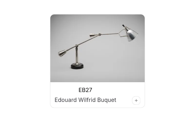 press · state — medium
Card that morphs into a dialog (shared layout) — the signature motion-primitives piece for galleries/case studies. Only the backdrop has colour (white/black 40%); you style the card with tokens.
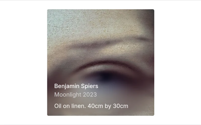 enter — subtle
Layered backdrop-filter blur gradient for edges of scroll areas/images. Colourless; backdrop-filter costs GPU — keep blurLayers low.
 state — subtle
Odometer-style rolling digits (spring). Inherits colour; pair with in-view for stats.
 enter — subtle
Most flexible text entrance primitive (per char/word/line, presets + custom variants, trigger prop). Unstyled — inherits theme. Install via @motion-primitives or `npx motion-primitives add`.
 state — subtle
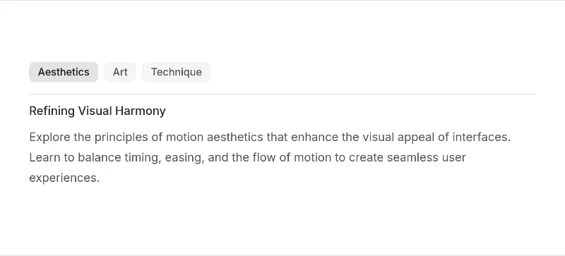
Animated content swap between tab panels/steps (AnimatePresence wrapper). Colourless.
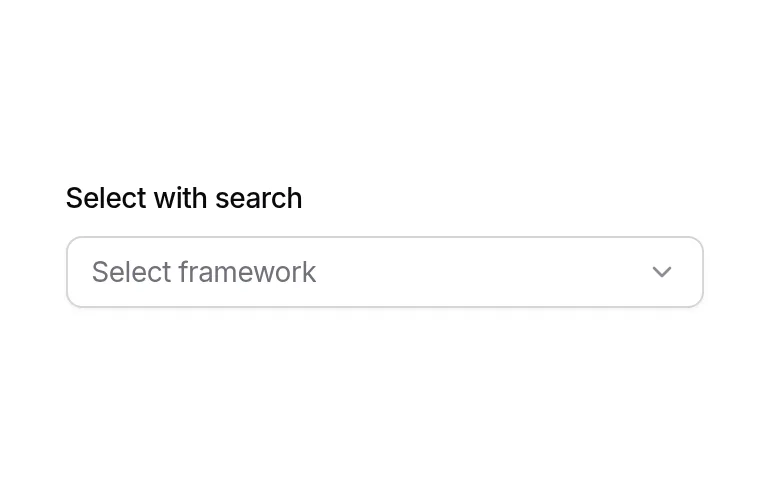
Searchable combobox (popover + command) with label — drop-in for long select lists.
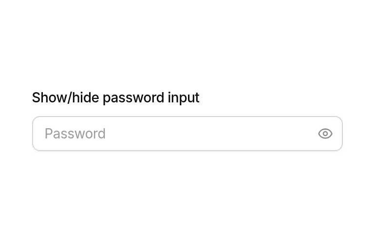
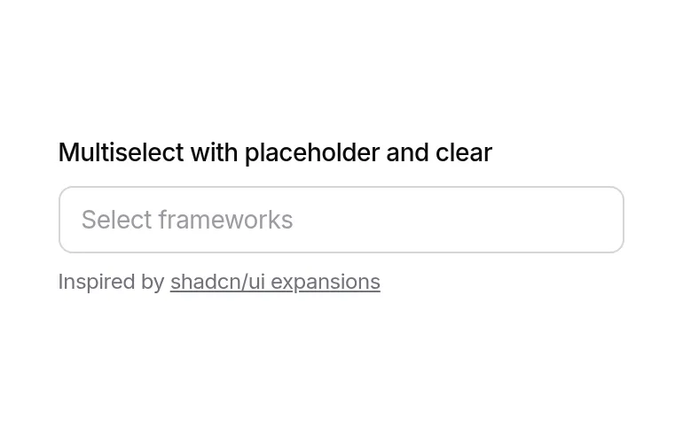
Multiselect with removable tag chips + search. Uses Origin's `multiselect` primitive (not in stock shadcn).
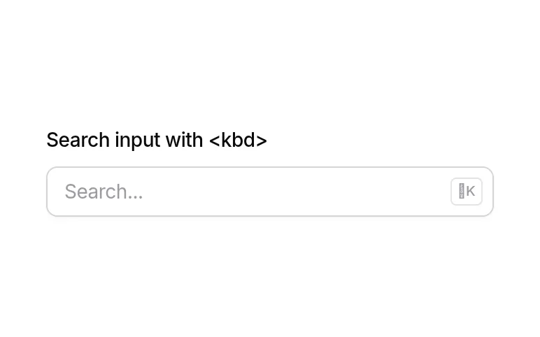
Search input with ⌘K kbd hint — standard app header search field.
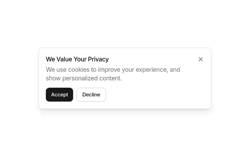
Cookie/GDPR consent notification with buttons. Small and token-based; wire up persistence yourself.
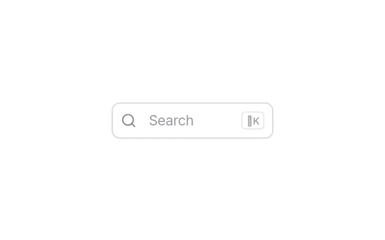
Command palette (command + dialog) with search — pair with comp-25 as the trigger and bind ⌘K yourself.
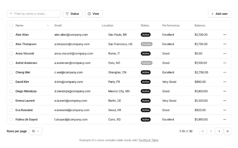
Full TanStack data table: search, column filters, visibility toggles, row selection, delete, pagination. Best free 'admin table' starting point. Pulls Origin's own table/button/select primitives (see gotchas).
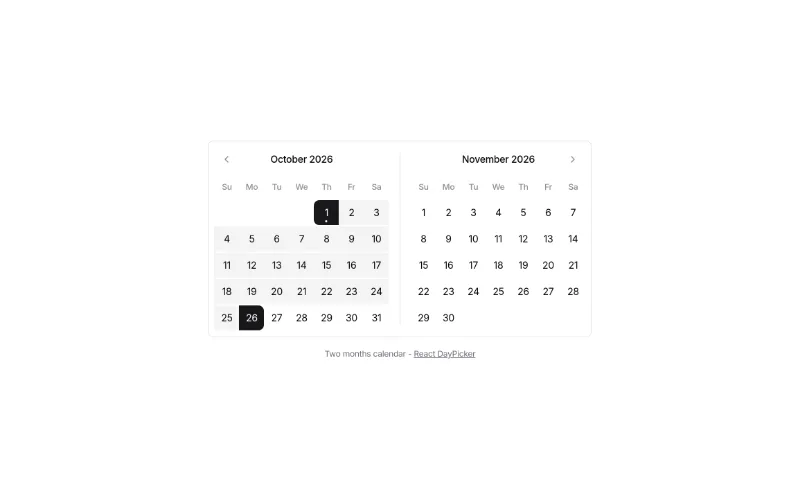
Range calendar (react-day-picker) for date-range filters.
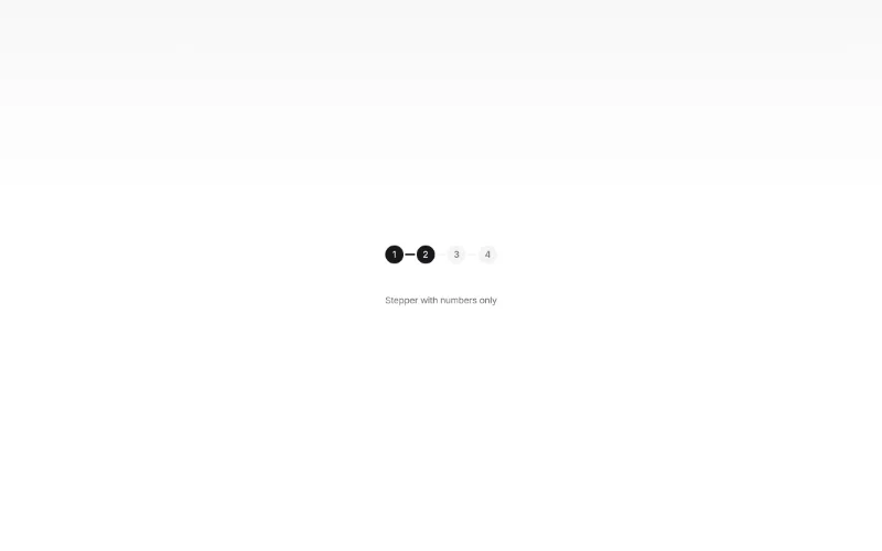
Stepper for multi-step forms / onboarding (Origin's stepper primitive, not in stock shadcn).
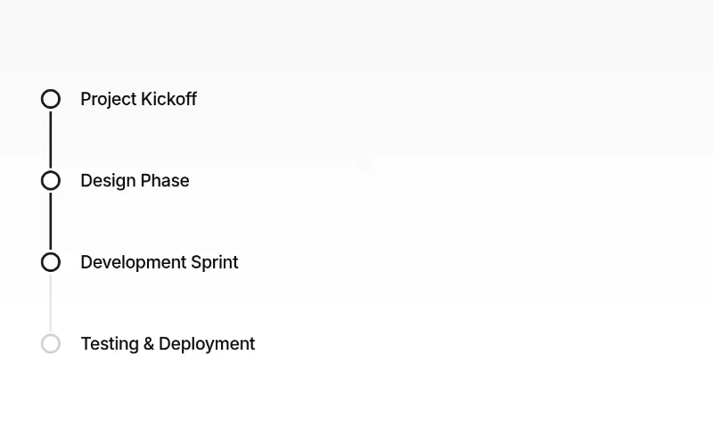
Timeline (Origin's timeline primitive) — changelogs, order history, activity.
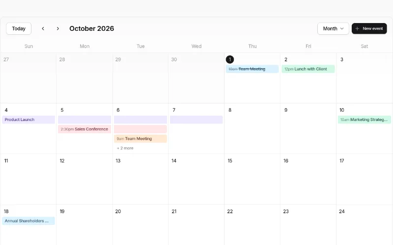 drag — medium
Event calendar (month/week/day/agenda, drag-and-drop, event dialog) — a whole feature for free. Heavy: dnd-kit, date-fns, @remixicon/react, ~12 primitives. Event colours are a fixed palette (sky/amber/violet/rose/emerald/orange).
Avatar upload with crop dialog + zoom slider. Uses Origin's cropper primitive and use-file-upload hook.
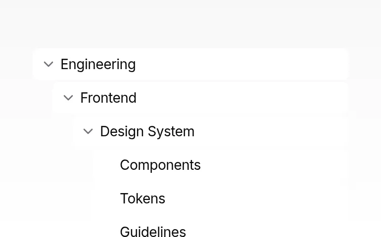
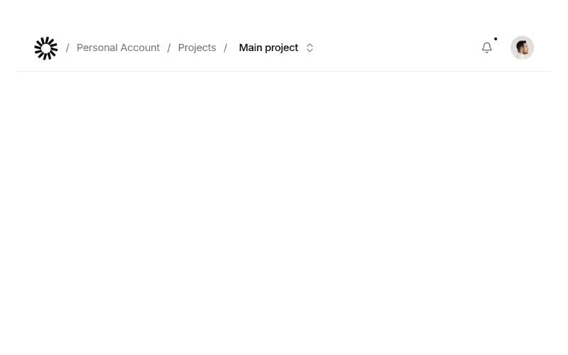
App navbar with breadcrumb, notification popover and user menu — complete product header. Logo is a placeholder SVG.
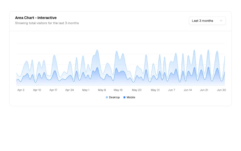
Area chart with time-range select — the dashboard hero chart. Colours come from --chart-1..5 (all our design systems define them).
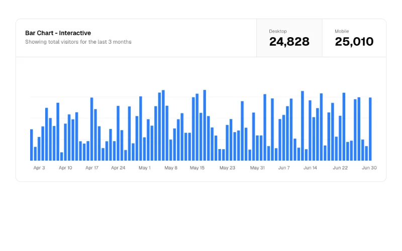
Bar chart with metric toggle in the card header. Recharts via the shadcn chart component.
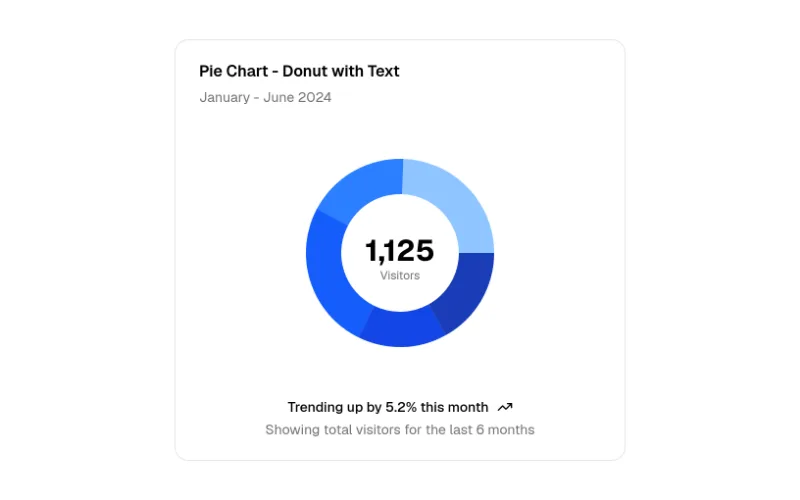
Donut with total in the centre — compact KPI breakdown.
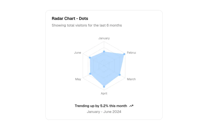
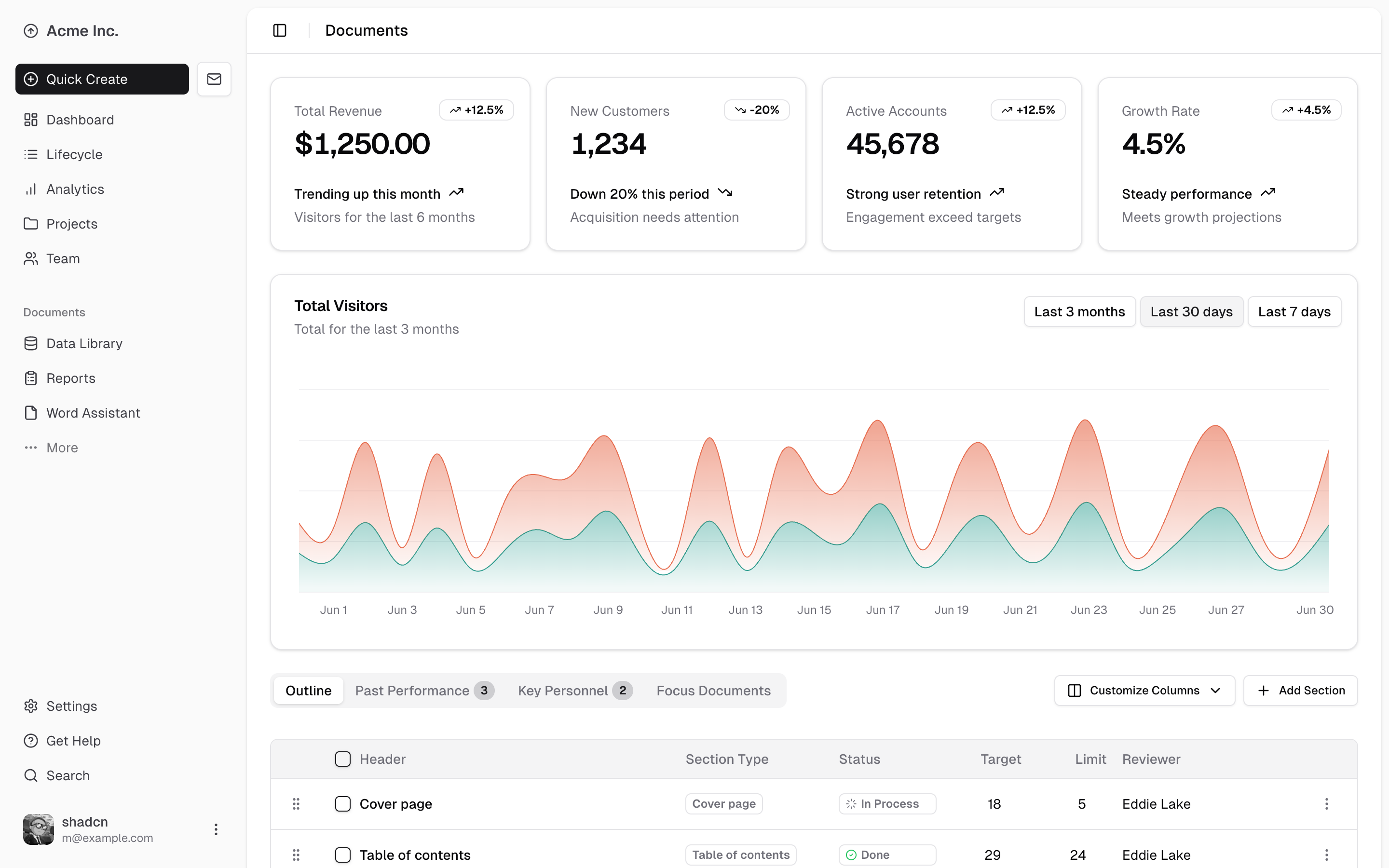
The reference SaaS dashboard: inset sidebar, KPI cards, interactive area chart, dnd-sortable data table. Writes app/dashboard/page.tsx + data.json and many components/* files. Uses @tabler/icons-react (swap for lucide if you like).
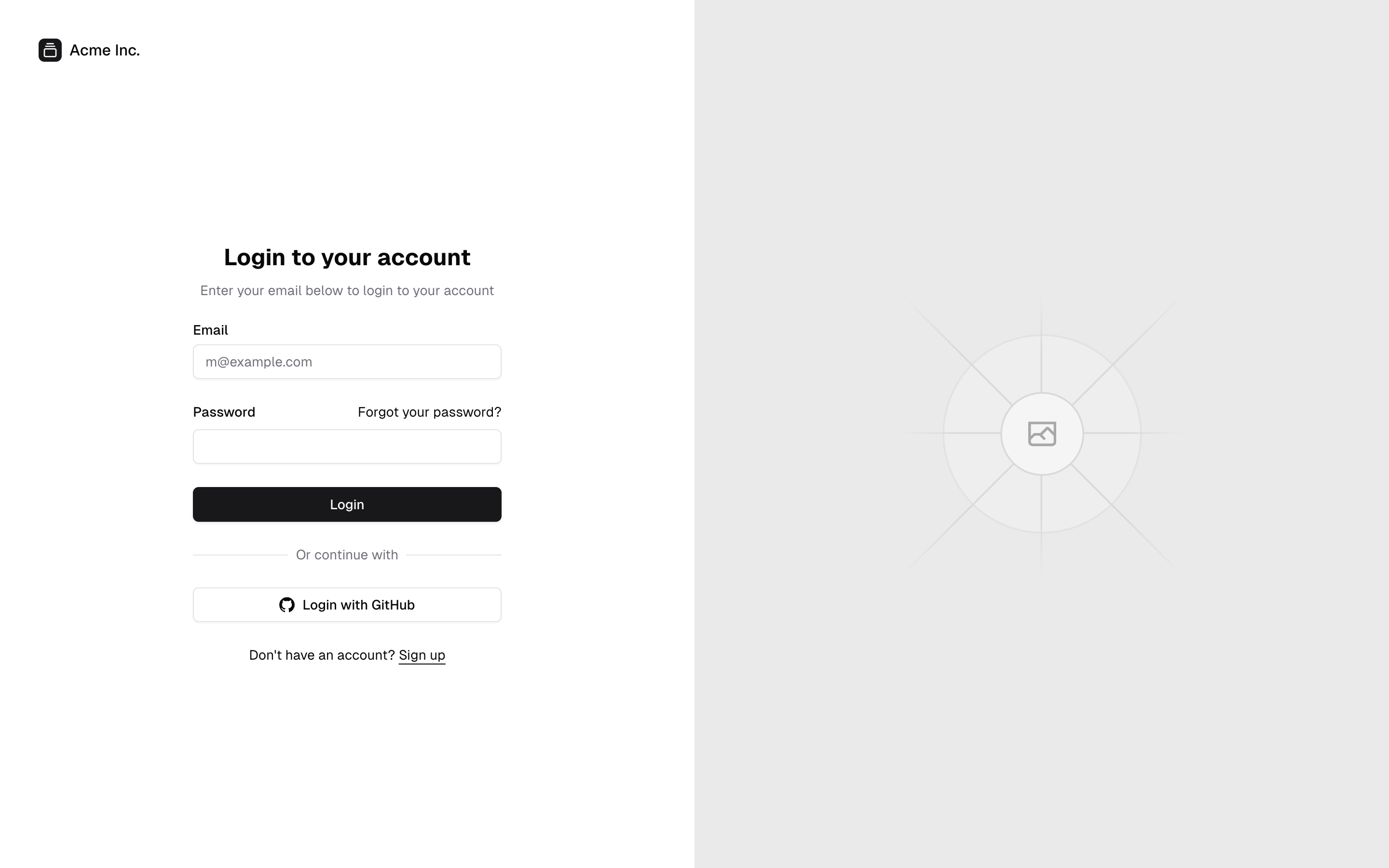
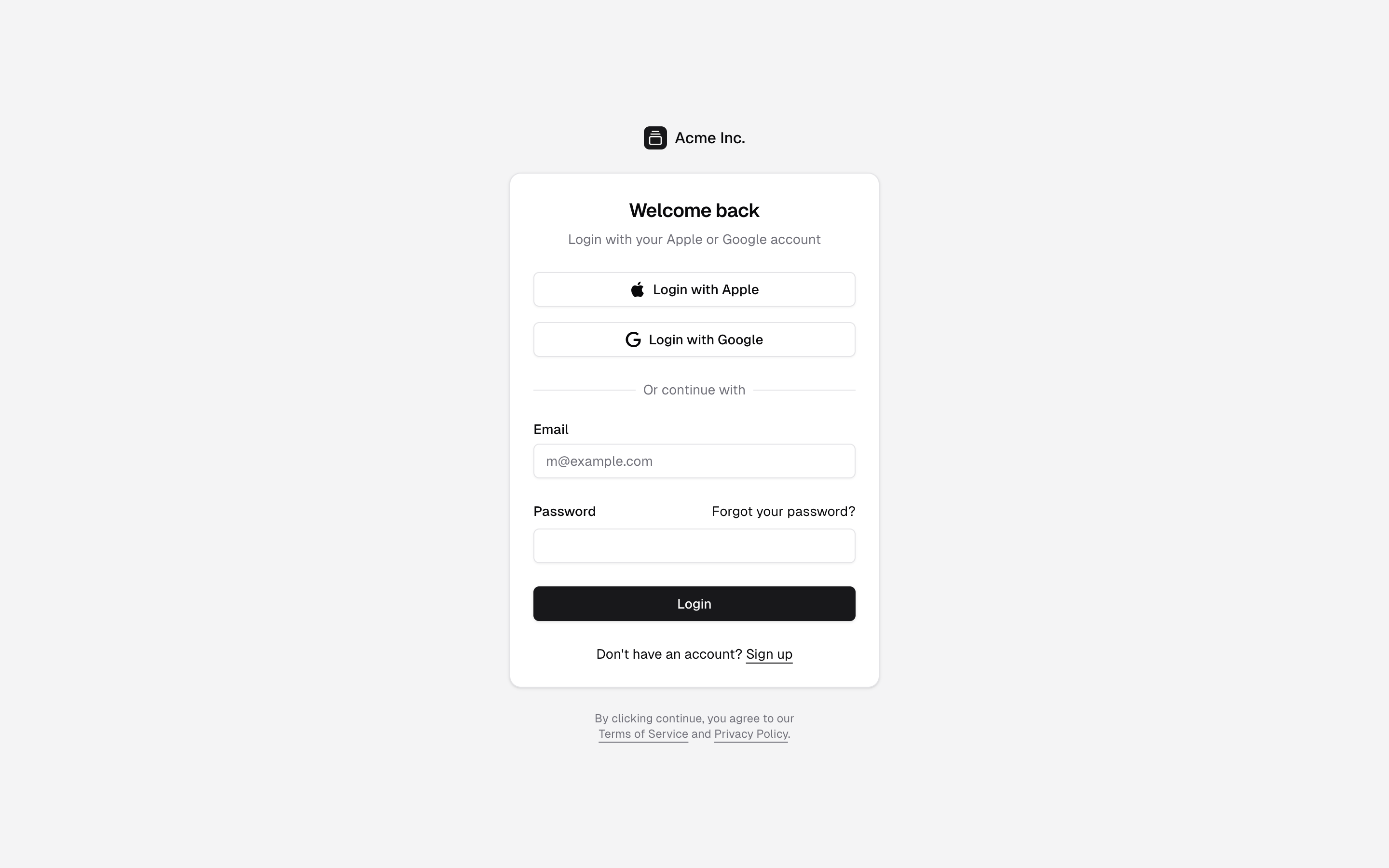
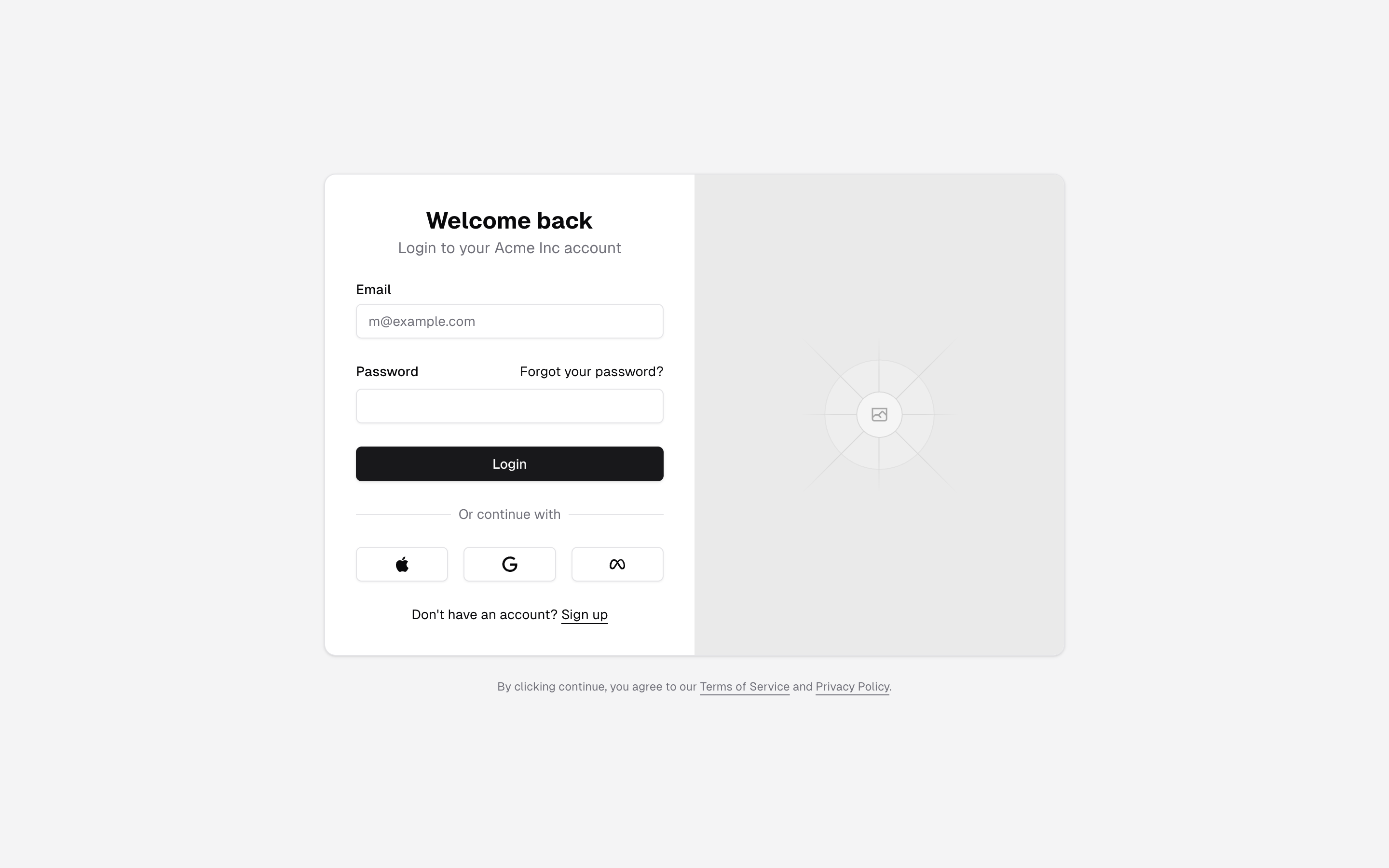
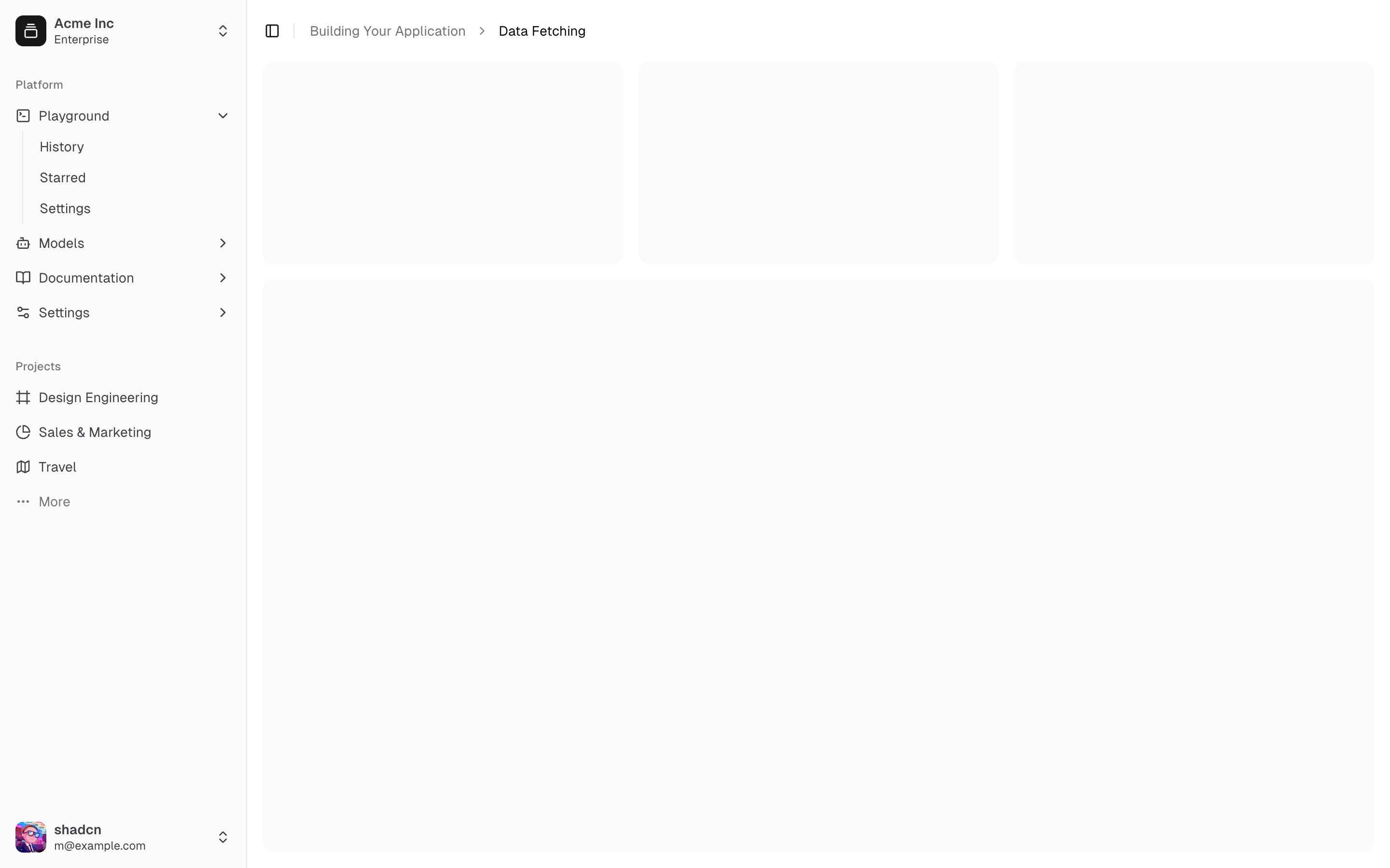
Sidebar that collapses to icons, with team switcher + user menu — the best default app shell. Writes app/dashboard/page.tsx and components/app-sidebar.tsx (installing another sidebar-NN overwrites it).
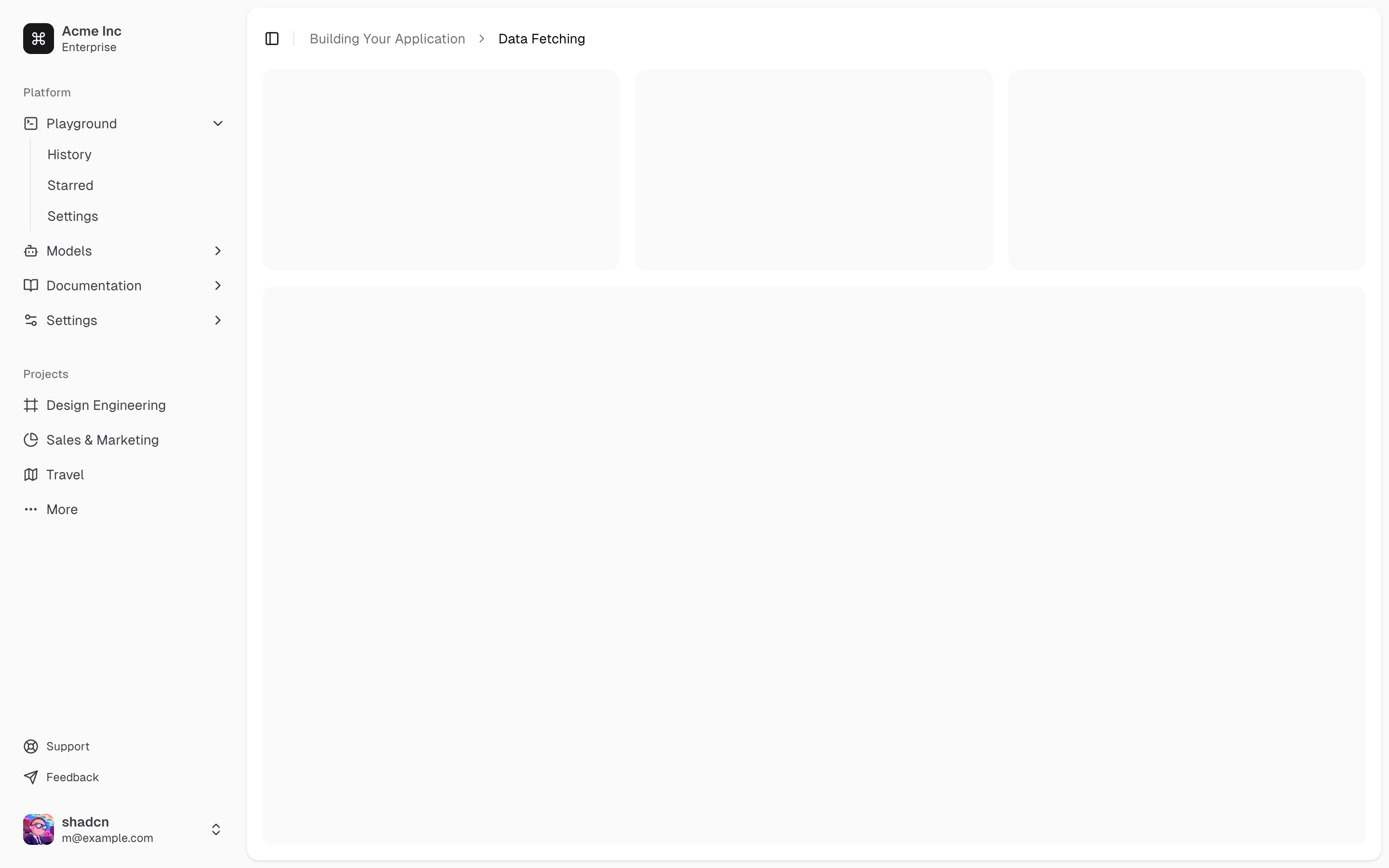
Inset sidebar with secondary nav — Linear/Vercel-style shell.
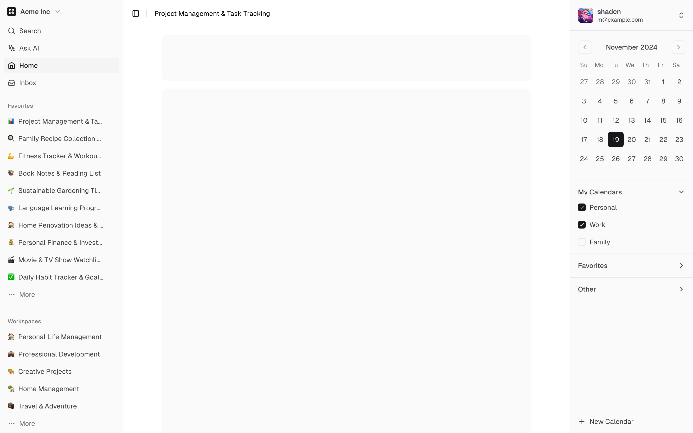
Left nav + right sidebar (calendar) — three-column layouts like mail/calendar apps.
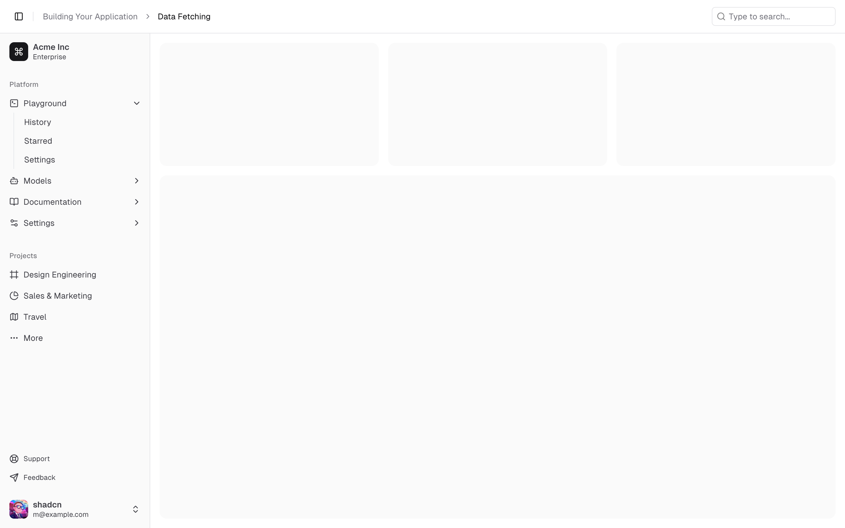
Sidebar under a sticky site header (search + breadcrumb) — for apps with a global top bar.
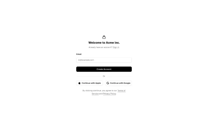
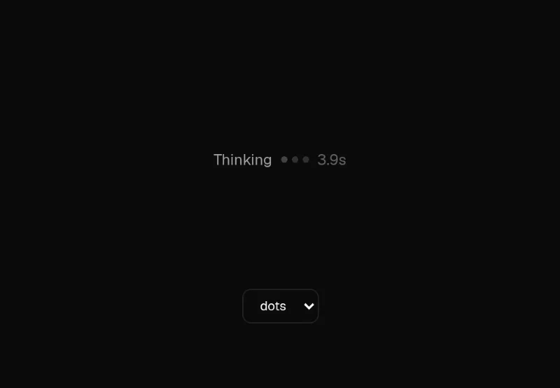 loop — subtle
Three small AI waiting indicators (dots, sweep bar, 3×3 pixel grid) sharing one cycle length so they can be mixed on a page, with an optional elapsed-seconds counter, aria-live and an sr-only label. Drawn in currentColor — set the text colour and it follows the theme. Lighter than canvas orbs for inline 'working…' states; use oc/agent-status for the primary agent indicator.
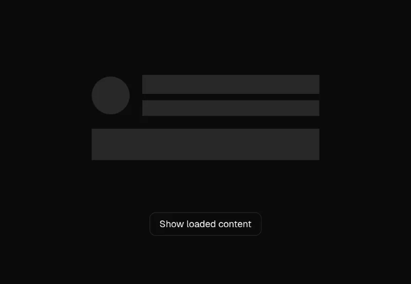 loop — subtle
Wrap real content in <Skeleton loading> and it renders an invisible copy with a pulsing overlay of exactly the same size — no hand-sized placeholder boxes, zero layout shift when data lands. No deps; bg-muted-foreground/20 + Tailwind animate-pulse. Does NOT honour reduced motion — add motion-reduce:animate-none. Pair with transitions/skeleton-reveal for the crossfade out.
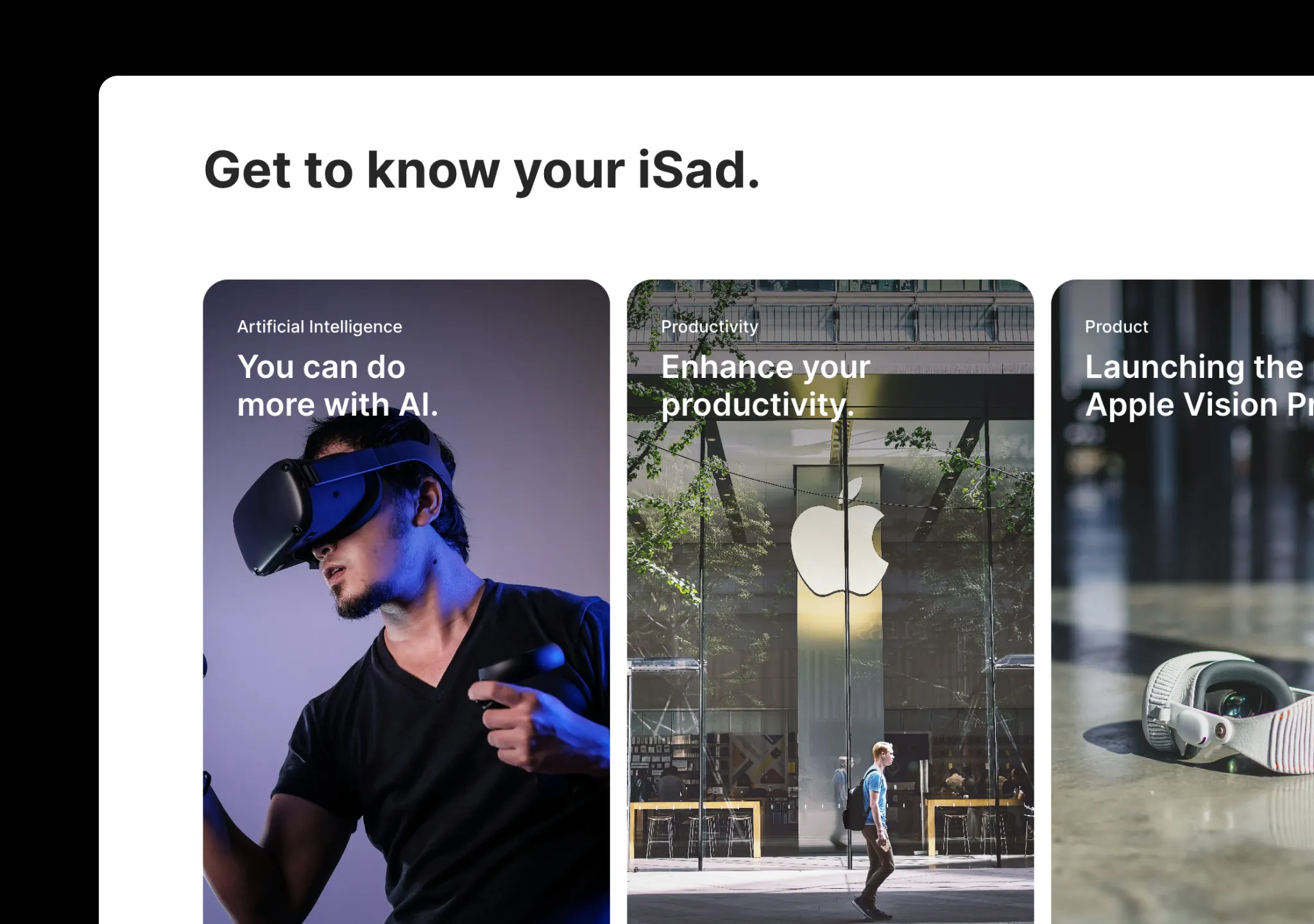 press · state — medium
Apple-style card carousel that expands into a detail view.
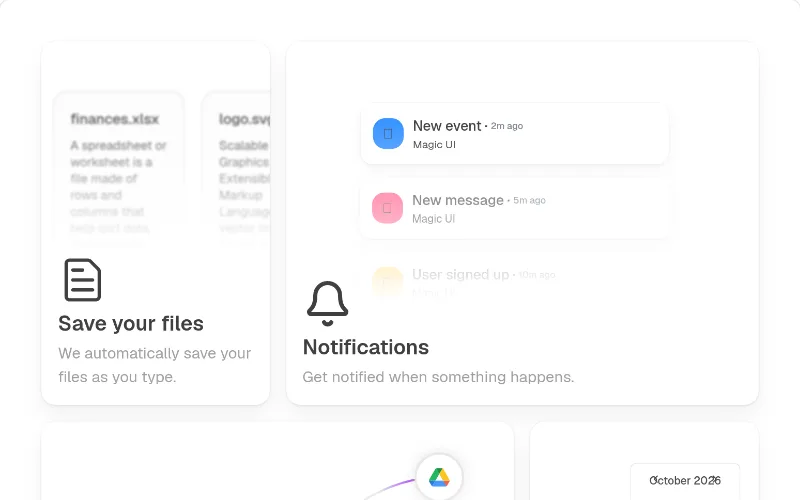 hover — subtle
Feature bento with icon + hover CTA. Hard-codes neutral-*/black alpha colours and needs @radix-ui/react-icons — prefer @oc/feature-bento, or swap to bg-card/text-muted-foreground.
 loop — subtle
Shimmer sweep for 'Thinking…' / loading text. Colours come from --base-color/--base-gradient-color defaults (zinc) — override via className.
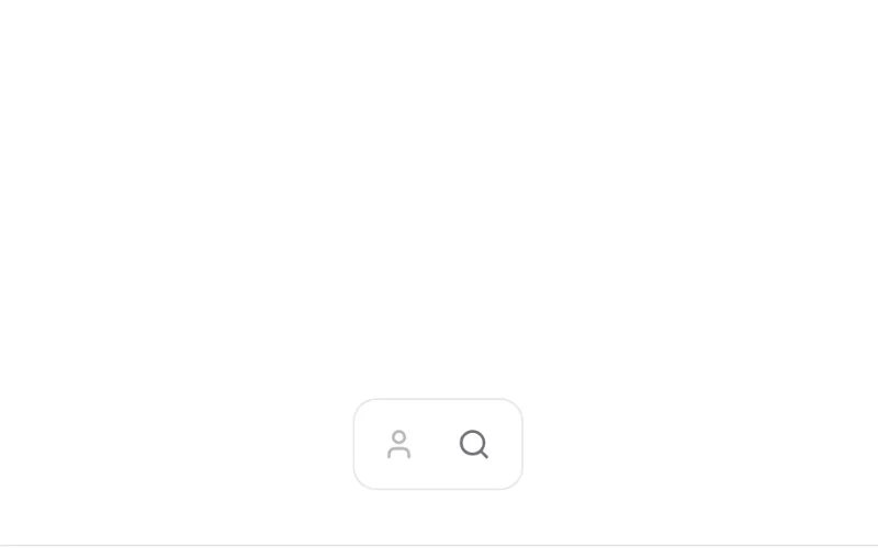 press · state — medium
Toolbar that expands into a search/input panel. Hard-codes zinc/white — swap to bg-popover/border/text-muted-foreground before using.
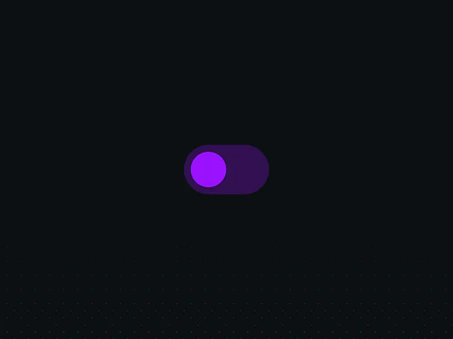 state — subtle
`layout` prop: elements animate to their new size/position when state changes (expanding cards, accordion rows, reflowing grids). No height hacks. Free example (motion is MIT); copy and adapt the source from the example page.
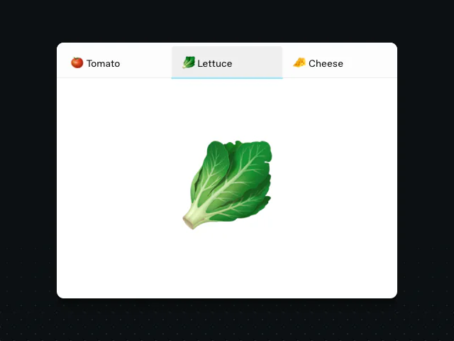 state — subtle
Shared-element layoutId: a tab underline / pill that glides between items. The free, hand-rolled way to animate tabs, nav highlights and segmented controls — about 10 lines with `layoutId`. Free example (motion is MIT); copy and adapt the source from the example page.
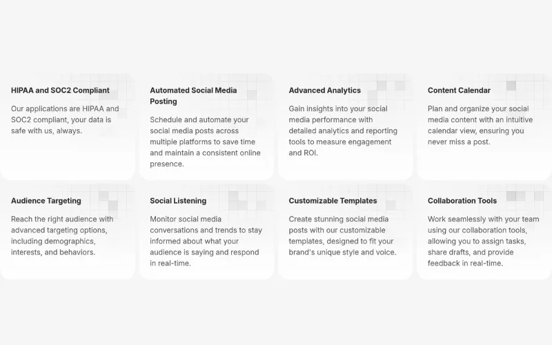
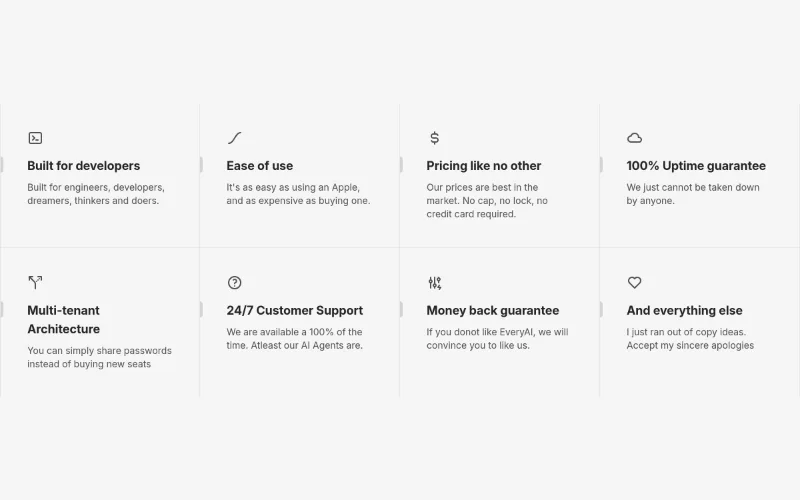
 loop · state — subtle
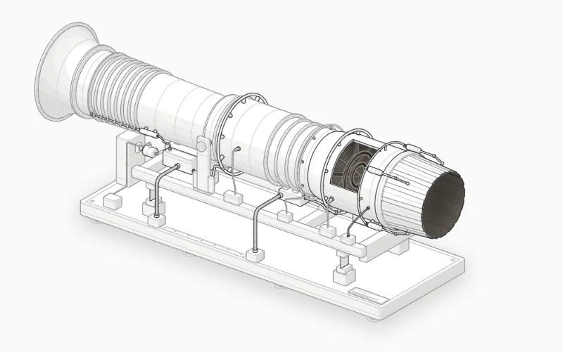 loop · state — medium
Import Afterburner from "anatomy-figures/afterburner" (default export). MIT; React 18+. Its --anatomy-* tokens need mapping to your project's theme. Isometric does not imply freely rotating 3D. Live interaction is on the source site; our thumbnail is a still screenshot.
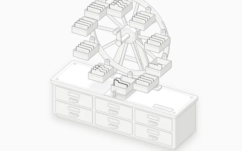 loop · state — medium
Import BTree from "anatomy-figures/b-tree" (default export). MIT; React 18+. Its --anatomy-* tokens need mapping to your project's theme. Isometric does not imply freely rotating 3D. Live interaction is on the source site; our thumbnail is a still screenshot.