 design-infra
Component catalog
Find components by type and feeling. Explore live examples, shortlist your options, and copy your picks to your agent.
Filter by feeling, motion, usage or library · 1 active
800 total results · 467 with visual previews · 333 on source sites
 loop — medium
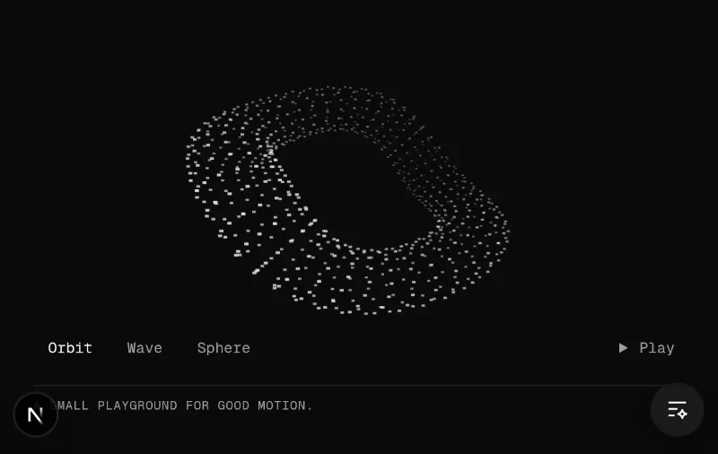 loop · cursor · state — medium
♥ The user explicitly asked to keep Kinetic Field in the homepage examples. Retain its pointer-responsive particle forms and controls.
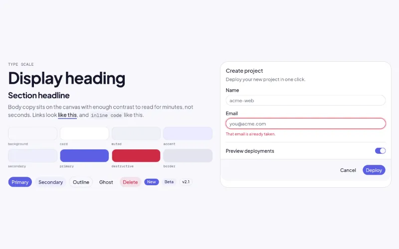
Writes DESIGN.md to the project root + theme tokens + fonts. Read design-systems/soft-glass/DESIGN.md first.
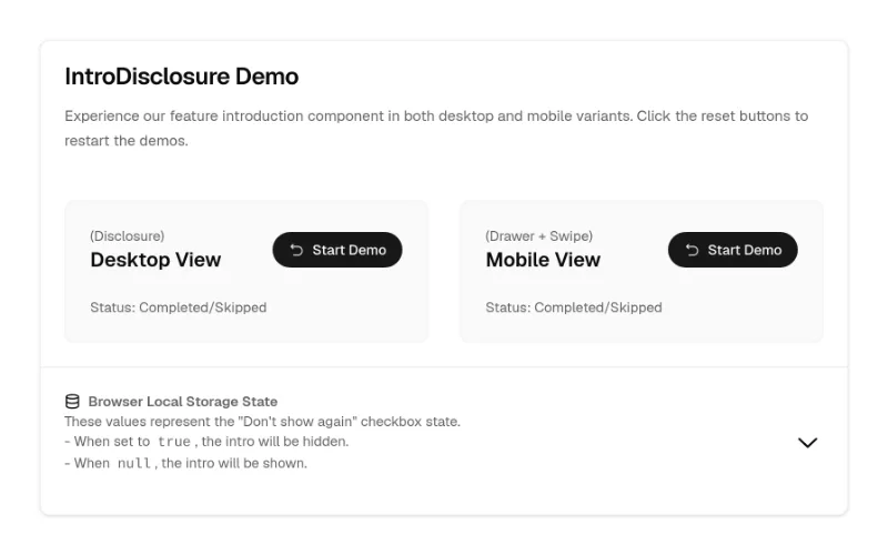 state — subtle
Feature-announcement/onboarding modal with media steps, 'don't show again' and responsive dialog↔drawer. Tokens throughout (black only on the media frame). Pulls 6 shadcn primitives.
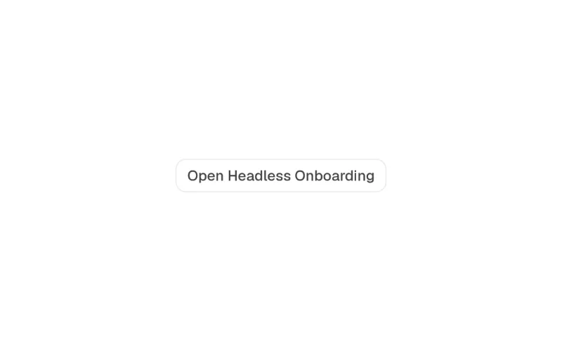
Compound multi-step onboarding (StepIndicator, ChoiceGroup, FeatureCarousel, TipsList; controllable state). Fully token-based — the safest Cult UI pick for app UI.
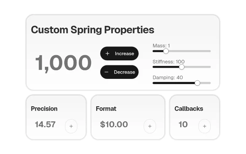 state — subtle
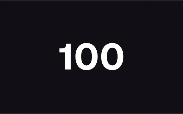
Small rolling-digit number (motion). Inherits colour.
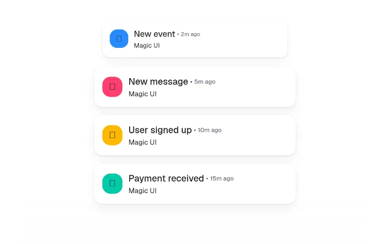 enter — subtle
Notifications/events appearing one by one — great 'activity feed' hero visual. Unstyled; you style the items with bg-card etc. Imports motion/react.
 press · state — medium
Light/dark toggle with a View Transitions clip-path reveal. Colourless (icons use currentColor). Uncontrolled it toggles <html class=dark> + localStorage itself; with next-themes pass theme/onThemeChange instead.
 enter — subtle
 hover — subtle
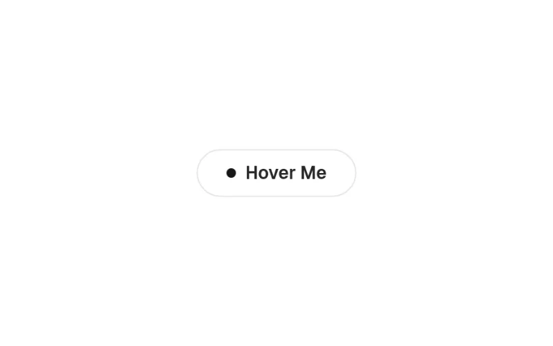
Pill button whose label slides out for an arrow + primary fill on hover. Uses bg-primary/text-primary-foreground — one of the few fully token-based Magic UI pieces.
 loop — medium
 enter — subtle
 enter — subtle
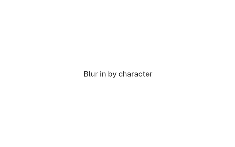
Per-word/char/line text entrance with ~10 presets (blurIn, slideUp, scaleUp…). Inherits colour — good default for hero headlines over Aceternity's text effects.
 enter · state — subtle
 hover · enter — medium
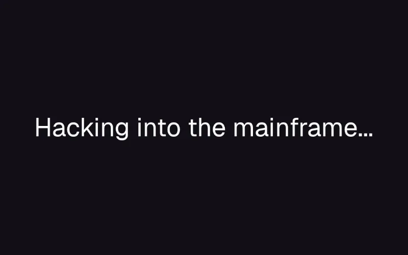
Scramble → reveal text on hover or in view (motion). Dev-tool/brutalist brands.
 loop — medium
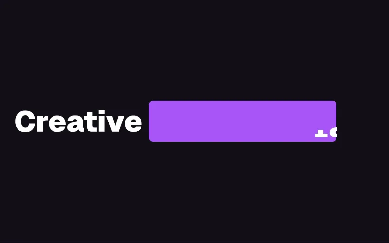
Rotating keyword in a headline with staggered letter transitions (motion). Unstyled — put bg-primary/text-primary-foreground on the pill yourself.
 scroll — medium
Paragraph that un-blurs and fades in word by word as you scroll — manifesto/about sections. GSAP ScrollTrigger.
 enter · scroll — medium
Char/word staggered entrance on scroll (GSAP SplitText + ScrollTrigger). Inherits colour. The React Bits headline effect; needs gsap + @gsap/react.
 enter · loop — subtle
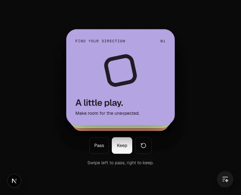 drag — medium
Tinder-style swipe deck: drag past a threshold or press ←/→ to commit; Like/Nope stamps and tinted washes fade in with the drag; imperative swipeLeft/swipeRight/reset handle; aria-live announcements; reduced-motion aware. Like uses text-green from SmoothUI's tokens.json, Nope uses text-destructive; the heavy inline card shadow is tuned for light backgrounds. Labels are props. Hosted demo supplies original artwork, explicit pass/keep/reset controls and a visible result.
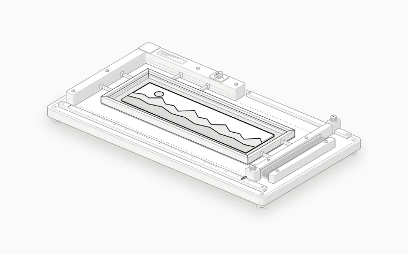 loop · state — medium
Import BoxModel from "anatomy-figures/box-model" (default export). MIT; React 18+. Its --anatomy-* tokens need mapping to your project's theme. Isometric does not imply freely rotating 3D. Live interaction is on the source site; our thumbnail is a still screenshot.
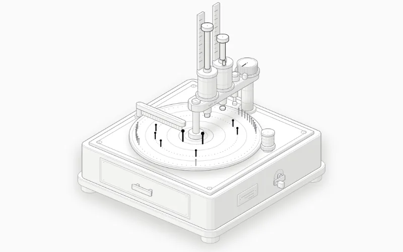 loop · state — medium
Import Debounce from "anatomy-figures/debounce" (default export). MIT; React 18+. Its --anatomy-* tokens need mapping to your project's theme. Isometric does not imply freely rotating 3D. Live interaction is on the source site; our thumbnail is a still screenshot.
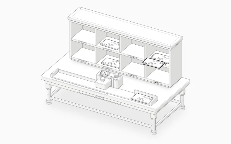 loop · state — medium
Import HashMap from "anatomy-figures/hash-map" (default export). MIT; React 18+. Its --anatomy-* tokens need mapping to your project's theme. Isometric does not imply freely rotating 3D. Live interaction is on the source site; our thumbnail is a still screenshot.
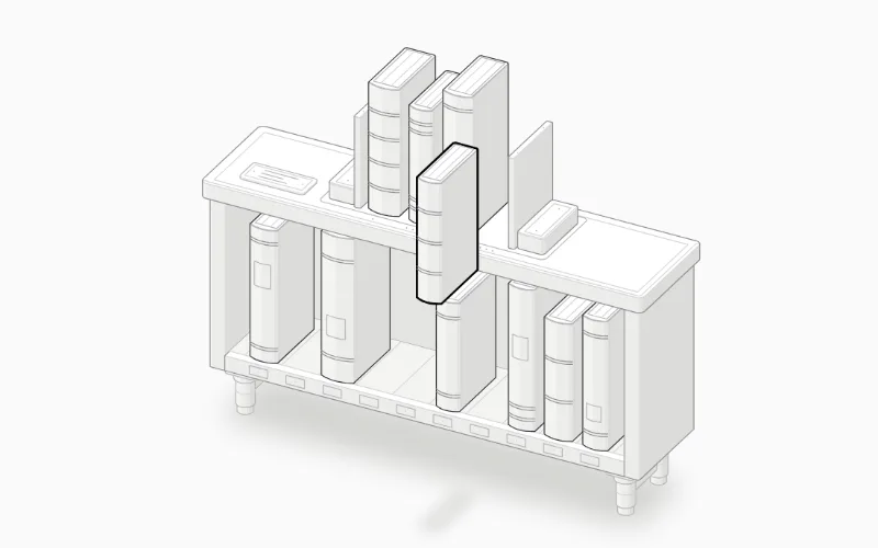 loop · state — medium
Import LruCache from "anatomy-figures/lru-cache" (default export). MIT; React 18+. Its --anatomy-* tokens need mapping to your project's theme. Isometric does not imply freely rotating 3D. Live interaction is on the source site; our thumbnail is a still screenshot.
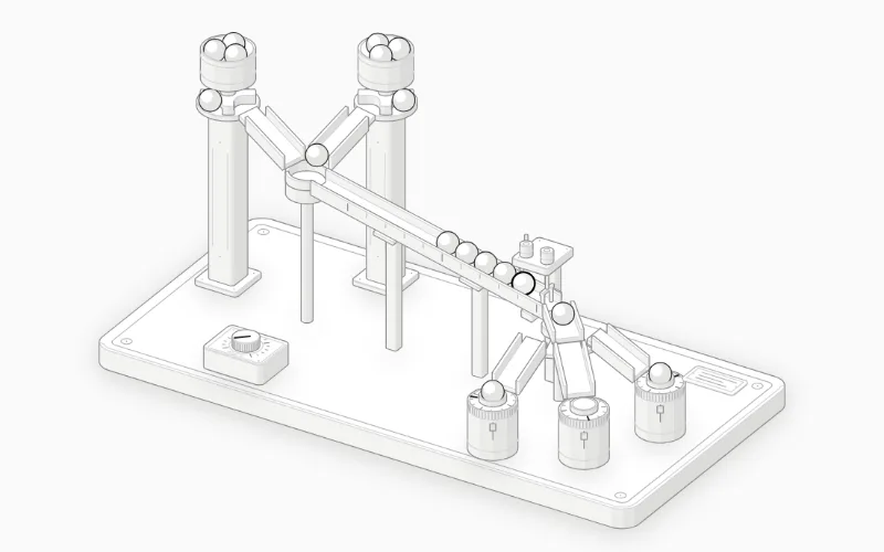 loop · state — medium
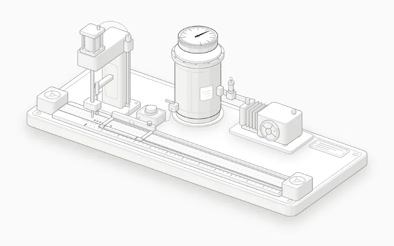
Import MessageQueue from "anatomy-figures/message-queue" (default export). MIT; React 18+. Its --anatomy-* tokens need mapping to your project's theme. Isometric does not imply freely rotating 3D. Live interaction is on the source site; our thumbnail is a still screenshot.
 loop · state — medium
Import RateLimiter from "anatomy-figures/rate-limiter" (default export). MIT; React 18+. Its --anatomy-* tokens need mapping to your project's theme. Isometric does not imply freely rotating 3D. Live interaction is on the source site; our thumbnail is a still screenshot.
 loop · state — medium
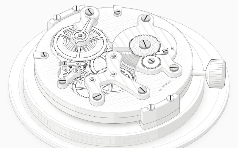
Import Watch from "anatomy-figures/watch" (default export). MIT; React 18+. Its --anatomy-* tokens need mapping to your project's theme. Isometric does not imply freely rotating 3D. Live interaction is on the source site; our thumbnail is a still screenshot.
 state — subtle
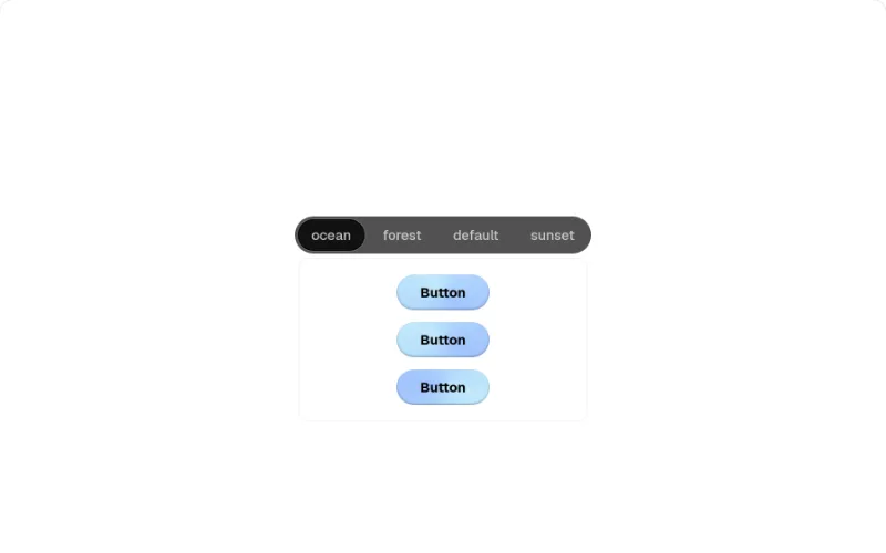
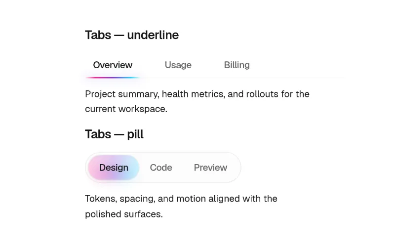
Tabs whose content slides in the direction of travel. Hard-codes neutral-600/700 + white text — swap to bg-muted/text-foreground.
 state — medium
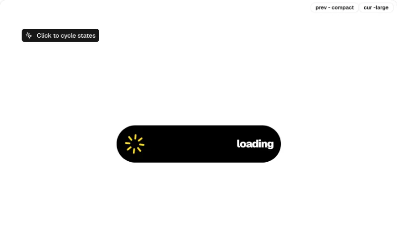
Apple Dynamic Island that morphs between sizes/states — fun status/notification widget. Hard-coded black pill; fine on any theme as a 'device' element.
 press · state — medium
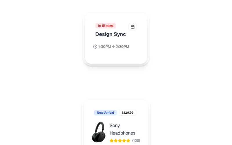
Compound card that expands to reveal details (motion + react-use-measure). Mostly bg-muted/ring-border, but one bg-white surface — check dark mode.
 state — subtle
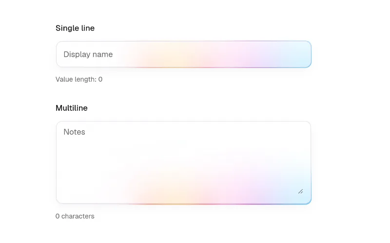
Input with animated focus halo + validation states. Tokens for border/text, Vercel-style rainbow hex for the glow — retint for your brand. @base-ui/react + motion.
 state · hover — subtle
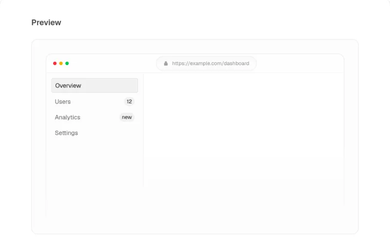
Browser-window frame for screenshots/demos; mostly tokens with literal traffic-light colours.
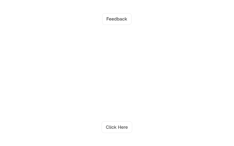 press · state — medium
Button that morphs into a small inline form (feedback, waitlist). Text uses tokens but surfaces are bg-white / dark:bg-[#121212] plus blue accents — swap to bg-popover.
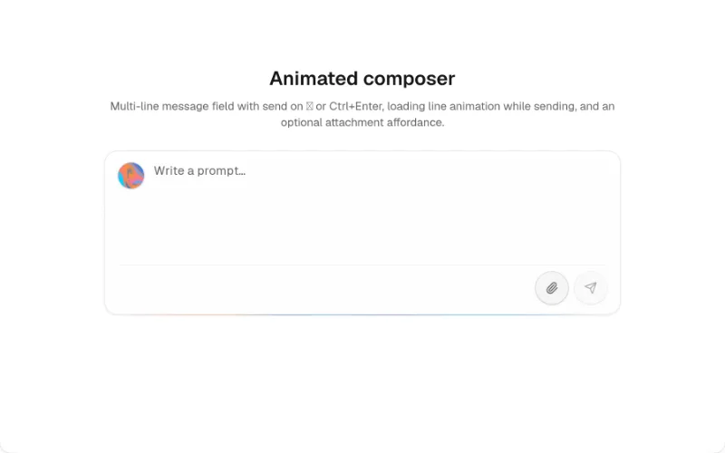 state · loop — medium
AI prompt composer with attachments/actions and a shader glow. Mostly tokens, but teal/blue hex accents and @paper-design/shaders-react + @base-ui/react are heavy deps.
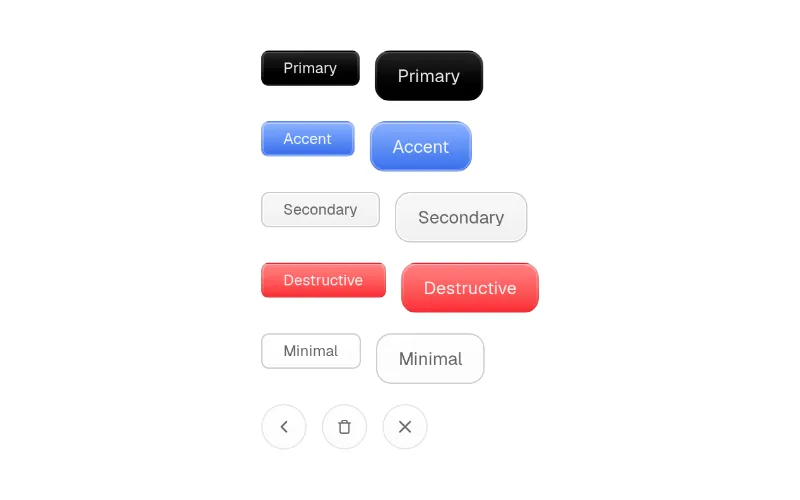 hover · press — subtle
Skeuomorphic textured button variants. Heavy hard-coded neutral/indigo gradients — fits soft-glass/editorial looks, clashes with flat themes.
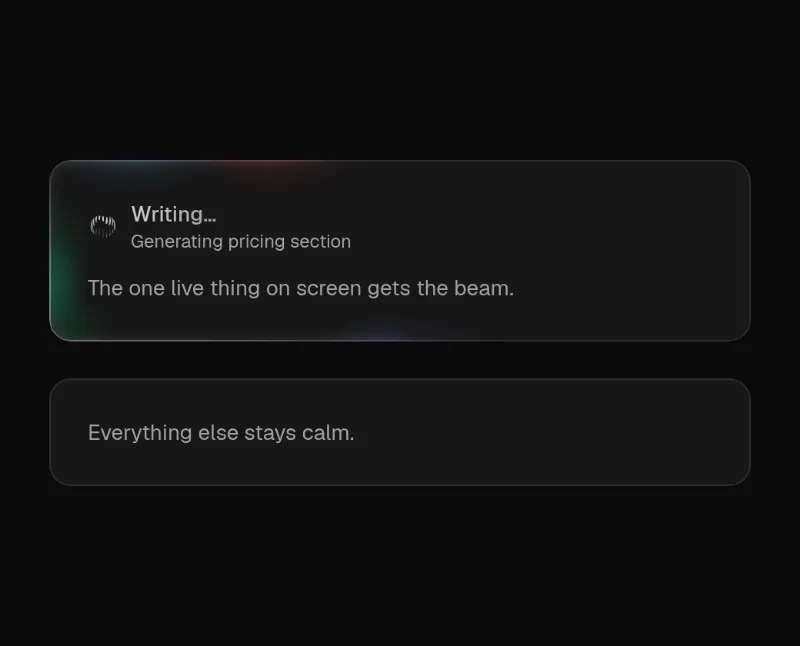
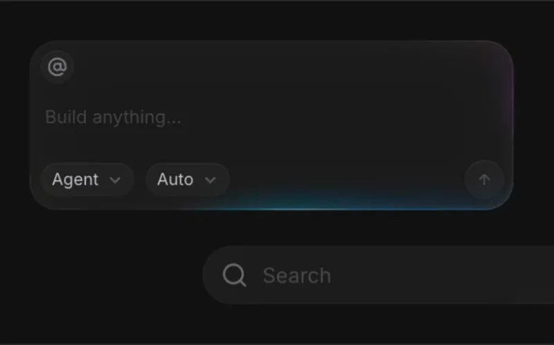 loop — medium
Use on ONE live element per screen. Wrapped by @oc/beam-card. theme prop defaults to dark — set theme='light' on light surfaces.
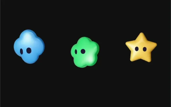 loop · state — subtle
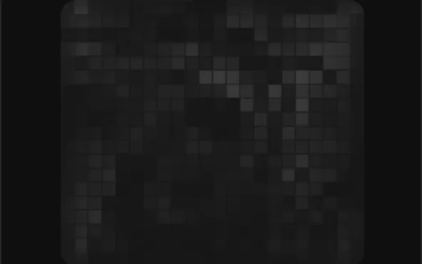 loop · state — expressive
 loop · cursor — expressive
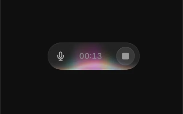 state · loop — medium
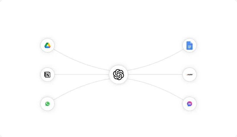 loop — medium
SVG beams flowing between refs — the 'integrations' diagram (your app in the middle, tools around it). Default gradient is orange→purple: set gradientStartColor/StopColor to var(--primary).
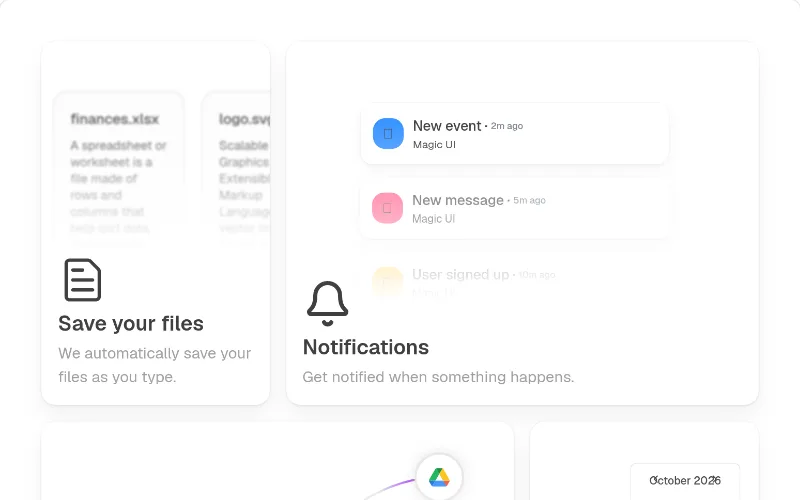 hover — subtle
Feature bento with icon + hover CTA. Hard-codes neutral-*/black alpha colours and needs @radix-ui/react-icons — prefer @oc/feature-bento, or swap to bg-card/text-muted-foreground.
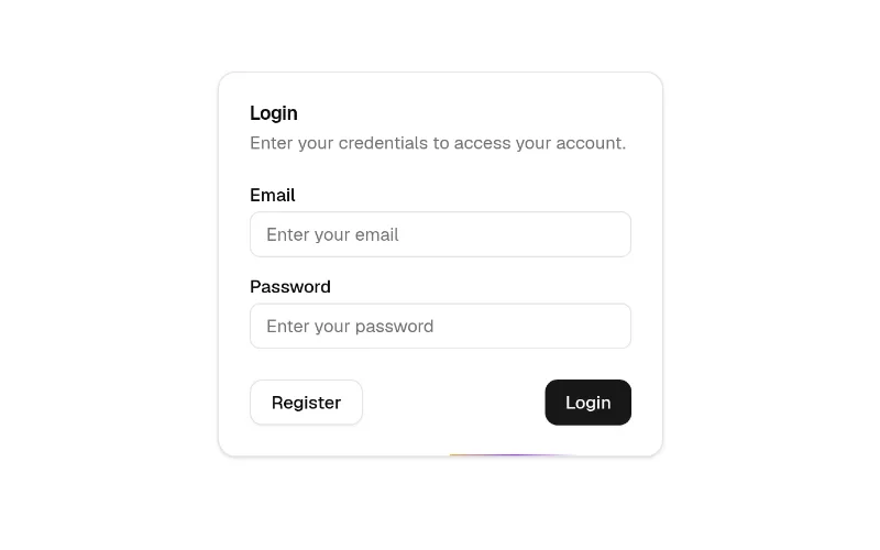 loop — subtle
Light travelling around a card's border; subtle way to highlight one pricing tier or the hero screenshot. colorFrom/colorTo default orange/purple — pass var(--primary). Parent needs `relative overflow-hidden rounded-*`.
 loop — subtle
Quiet SVG dot background (also grid-pattern / interactive-grid-pattern / flickering-grid). Dots use currentColor on a hard-coded text-neutral-400/80 — pass className="text-muted-foreground/40" plus a radial mask.
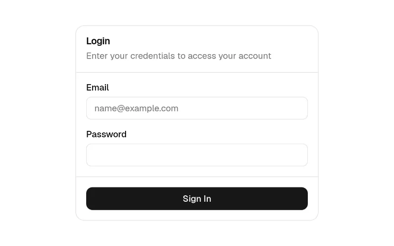 cursor · hover — subtle
Spotlight-follows-cursor card (bg-background surface). Gradient defaults are purple/pink hex and it imports next-themes — pass gradientFrom/To from the theme; drop next-themes if you don't use it.
 enter · state — subtle
Count-up number for stats sections. Hard-codes text-black dark:text-white — pass className="text-foreground" (or font-heading) to theme it.
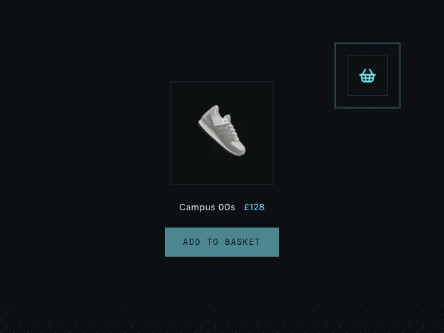 press · state — expressive
Product flies into the cart along an arc() path with a spring impact — e-commerce delight. Free example (motion is MIT); copy and adapt the source from the example page.
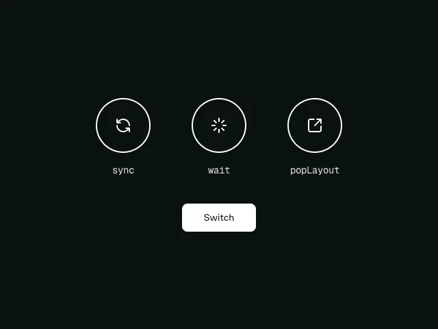 state — subtle
AnimatePresence `mode` (sync / wait / popLayout): how to swap one view for another — tab panels, carousel slides, step wizards — without overlap jank. Free example (motion is MIT); copy and adapt the source from the example page.
 state — subtle
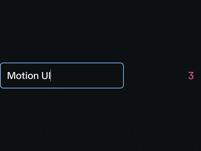
Character counter that animates as you type and warns near the limit — input feedback done right. Free example (motion is MIT); copy and adapt the source from the example page.
 drag — medium
 state — subtle
AnimatePresence exit: modals, toasts and removed list items animate OUT instead of vanishing. The fix for 'abrupt' close. Free example (motion is MIT); copy and adapt the source from the example page.
 cursor — medium
Element that follows the cursor with spring lag — custom cursors and spotlight followers without Motion+ Cursor. Free example (motion is MIT); copy and adapt the source from the example page.
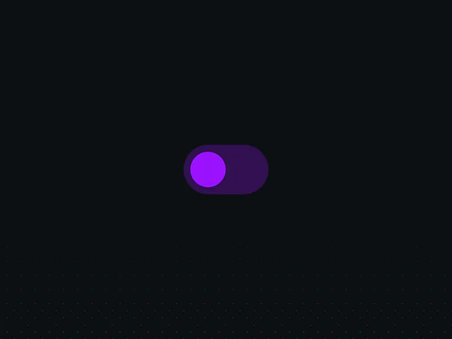 state — subtle
`layout` prop: elements animate to their new size/position when state changes (expanding cards, accordion rows, reflowing grids). No height hacks. Free example (motion is MIT); copy and adapt the source from the example page.
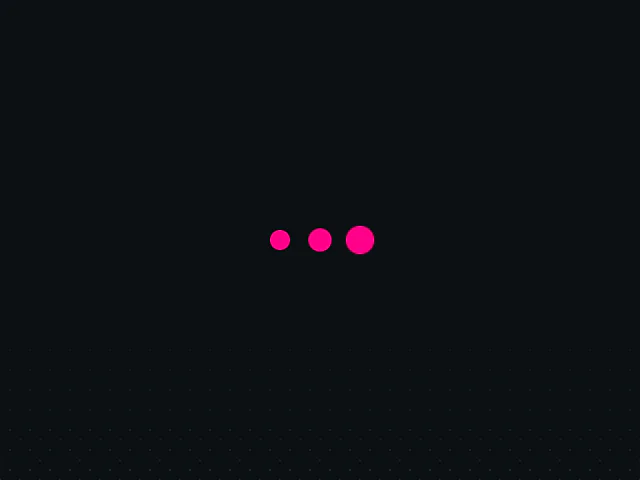 loop — subtle
Minimal three-dot pulse loader (variants + repeat). Free example (motion is MIT); copy and adapt the source from the example page.
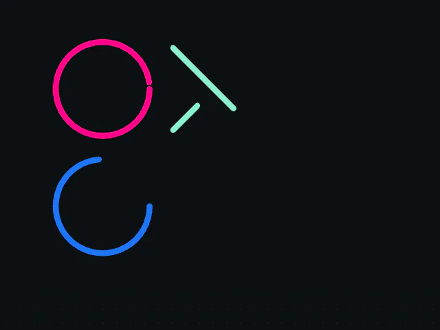 enter · state — subtle
pathLength: SVG line drawing for icons, checkmarks, signatures and diagrams. Free example (motion is MIT); copy and adapt the source from the example page.
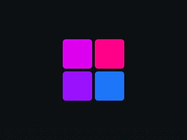 drag · state — medium
Reorder: drag-to-reorder lists with automatic layout animation — settings lists, kanban columns, playlists. Free example (motion is MIT); copy and adapt the source from the example page.
 hover · press — subtle
Button whose label rolls to a new word on hover/click — a free alternative to Motion+ text components. Free example (motion is MIT); copy and adapt the source from the example page.
 scroll — subtle
Header that hides on scroll down and returns on scroll up (useMotionValueEvent). Great default for marketing navbars. Free example (motion is MIT); copy and adapt the source from the example page.
 scroll — medium
useScroll + useTransform: progress bars and parallax tied to scroll position. Medium-intensity; keep it to one element per viewport. Free example (motion is MIT); copy and adapt the source from the example page.