 design-infra
Component catalog
Find components by type and feeling. Explore live examples, shortlist your options, and copy your picks to your agent.
Filter by feeling, motion, usage or library · 1 active
63 total results · 35 with visual previews · 28 on source sites
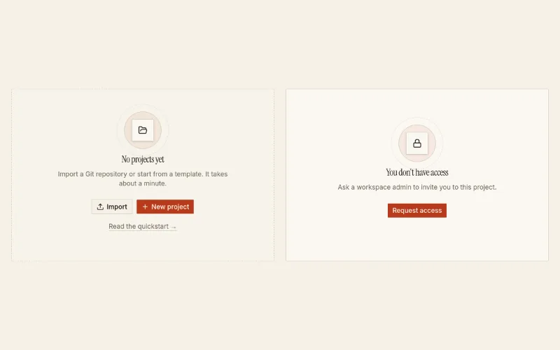
Zero-data / first-run placeholder: layered icon, title, one primary next step, optional secondary + help link. Dashed drop-zone or plain.
 loop — subtle
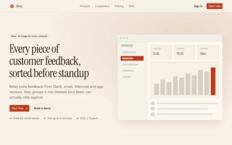
Starter page → app/page.tsx. Use existing compatible tokens, or install a theme only when requested; it pulls in 10 @oc blocks. Preview: /templates/template-landing.
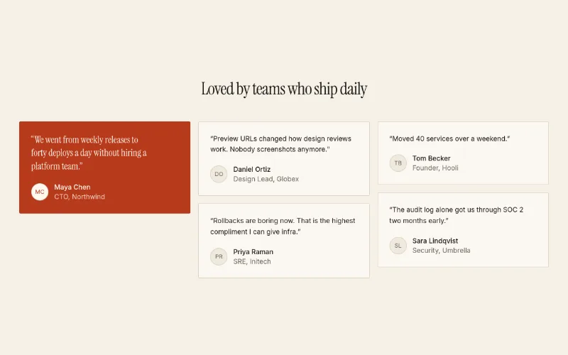
Masonry grid of customer quotes with avatars; one `featured` quote renders on a --primary fill in larger heading type.
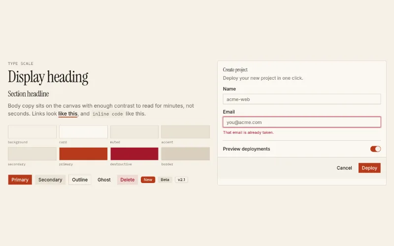
Writes DESIGN.md to the project root + theme tokens + fonts. Read design-systems/editorial/DESIGN.md first.
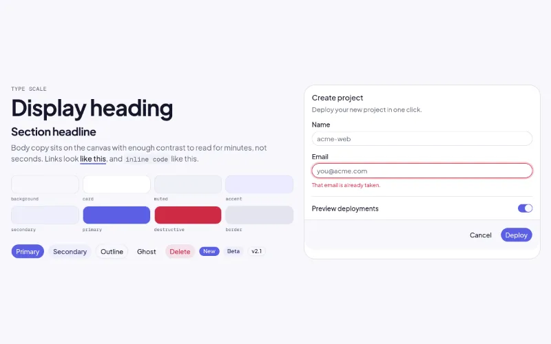
Writes DESIGN.md to the project root + theme tokens + fonts. Read design-systems/soft-glass/DESIGN.md first.
 drag — medium
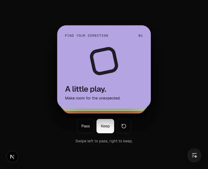
Tinder-style swipe deck: drag past a threshold or press ←/→ to commit; Like/Nope stamps and tinted washes fade in with the drag; imperative swipeLeft/swipeRight/reset handle; aria-live announcements; reduced-motion aware. Like uses text-green from SmoothUI's tokens.json, Nope uses text-destructive; the heavy inline card shadow is tuned for light backgrounds. Labels are props. Hosted demo supplies original artwork, explicit pass/keep/reset controls and a visible result.
 state · press — medium
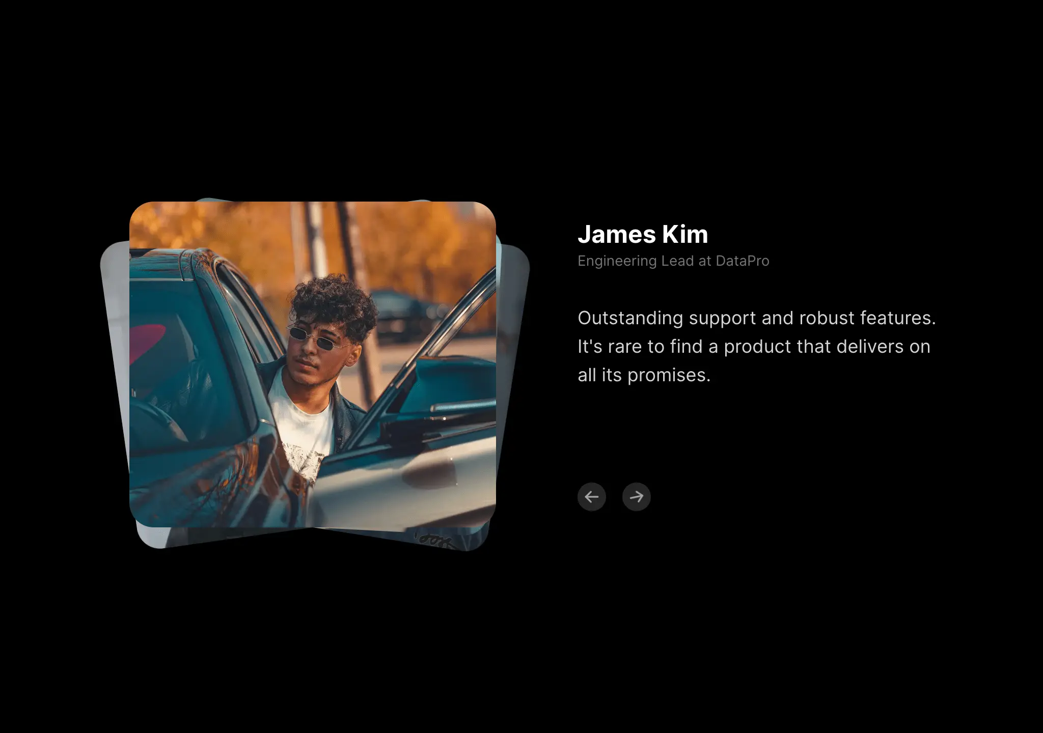
Photo + quote testimonials with stacked image transition. Good single-testimonial spotlight.
 state — subtle
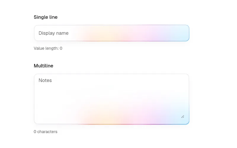
Input with animated focus halo + validation states. Tokens for border/text, Vercel-style rainbow hex for the glow — retint for your brand. @base-ui/react + motion.
 loop · state — subtle
 loop — expressive
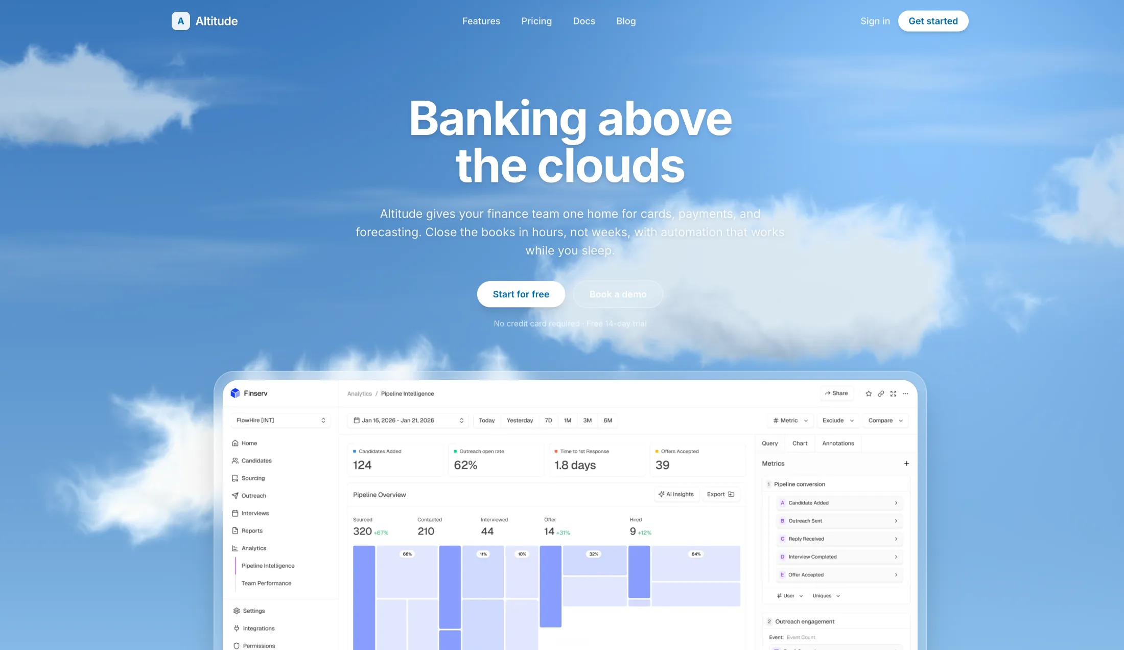
Soft procedural clouds that drift across the sky. Tune speed, count, and colors with props.
 loop — subtle
A glass morphism effect component using SVG filters with fractal noise to create visual transitions between sections
 enter — expressive
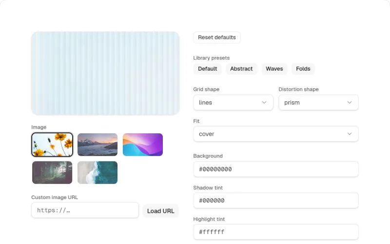
Paper Design fluted-glass image shader with sensible defaults — ribbed, streaked distortions over a source image
 loop · enter · state — subtle
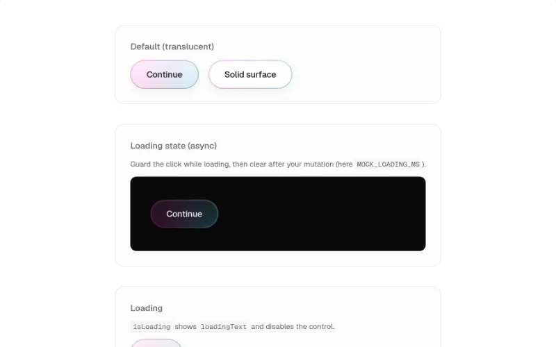
Primary action button with animated gradient rim, frosted fill, staggered label, and loading spinner
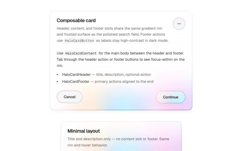 loop — medium
 state · hover — medium
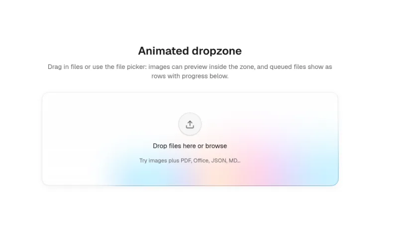
File dropzone with animated rim, frosted fill, moving border trail, and file-type glyphs
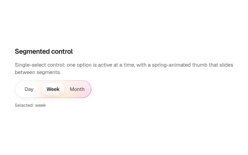 state — subtle
Segmented control with frosted track, gradient rim, and spring sliding thumb
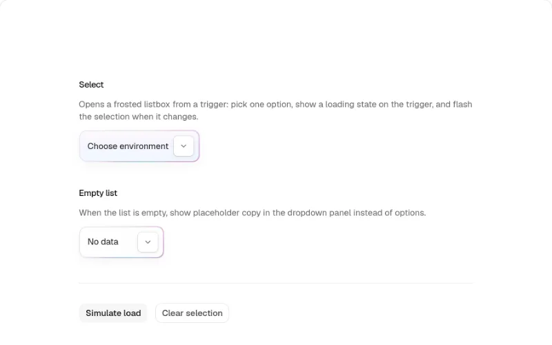 state · enter — subtle
Composable animated select with gradient rim, frosted fill, and staggered label
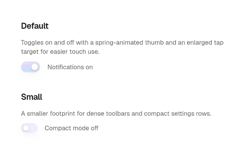 state — subtle
Toggle switch with spring thumb, frosted track, and extended touch hit area
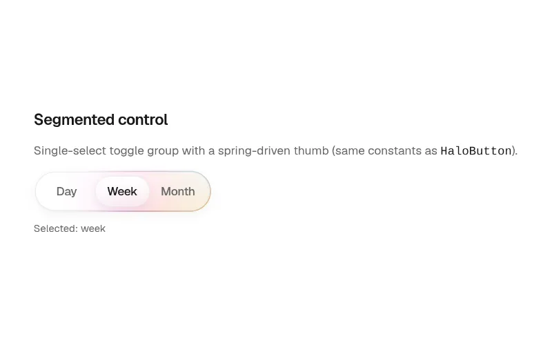 state — subtle
Segmented single-select control with frosted track, gradient rim, and spring-driven sliding thumb (aligned with Halo Button)
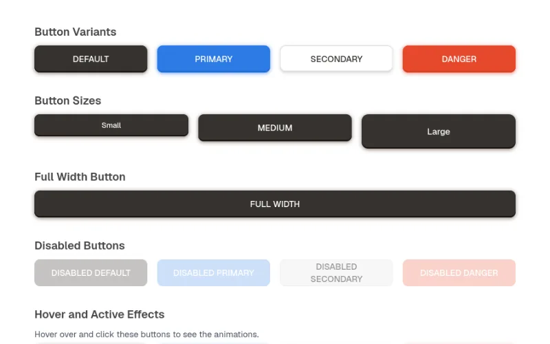 hover · press — subtle
Neumorphic button component with soft shadows and tactile interaction effects
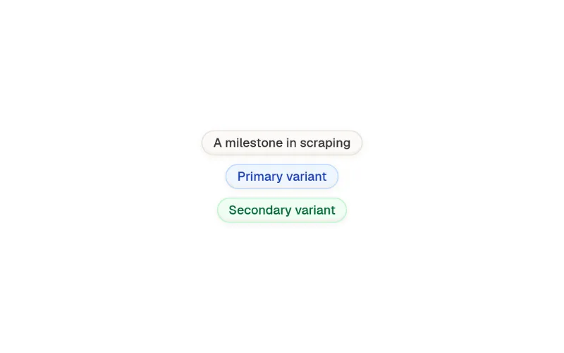
Neumorphic eyebrow component with soft shadow effects and modern styling
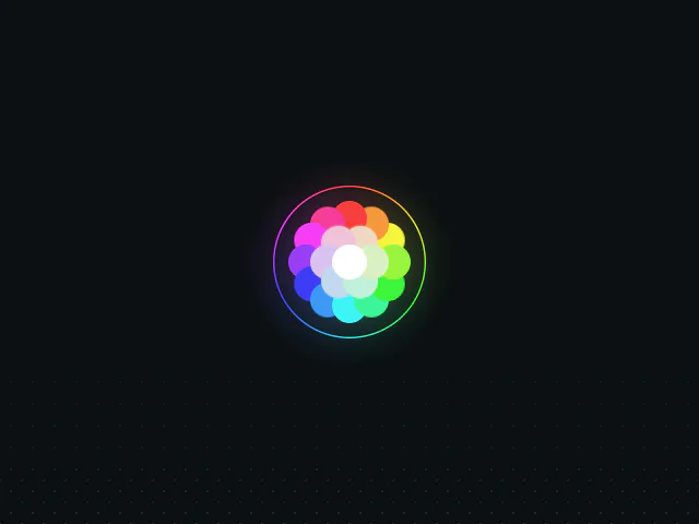 hover · cursor — subtle
An example of creating a circular color picker with dots that react to cursor movement with soft springs using Motion for React.
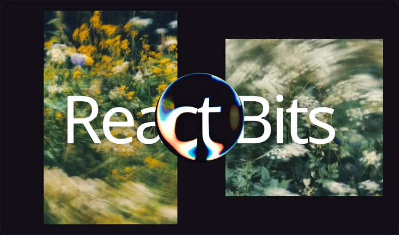 scroll — expressive
Glassmorphism container with animated liquid distortion refraction.
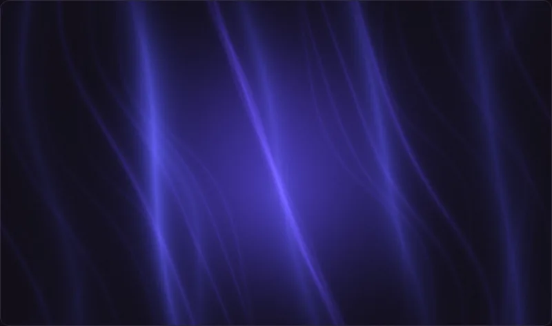 loop — expressive
A deep-blue recursive fiber field with luminous bands, radial twisting and soft atmospheric glow.
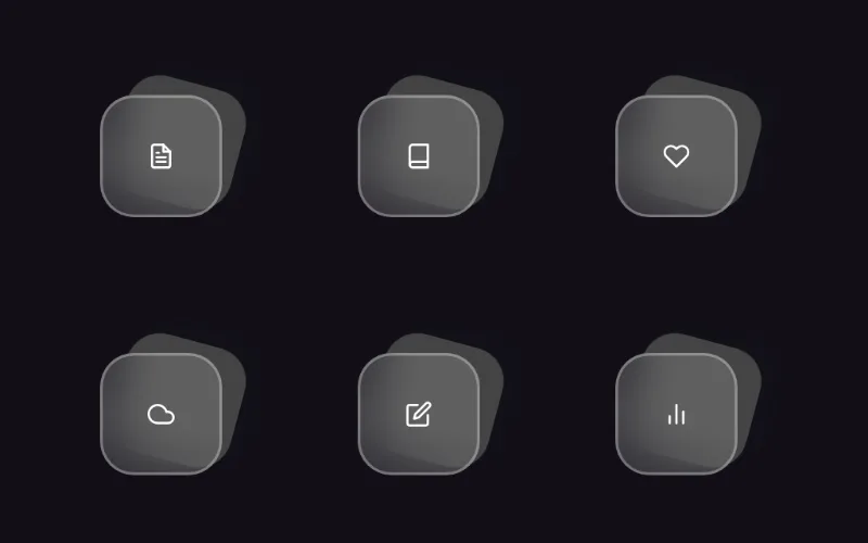 hover — subtle
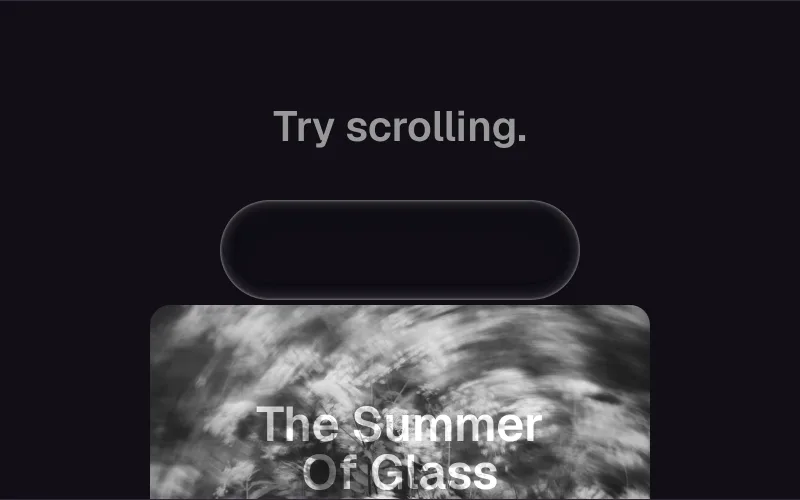
Advanced Apple-style glass surface with real-time distortion + lighting.
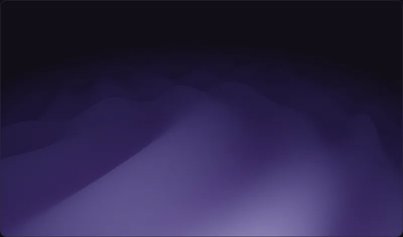 loop · cursor — expressive
Raymarched sine waves rolling toward a soft, hazy horizon.
 loop — expressive
 state — subtle
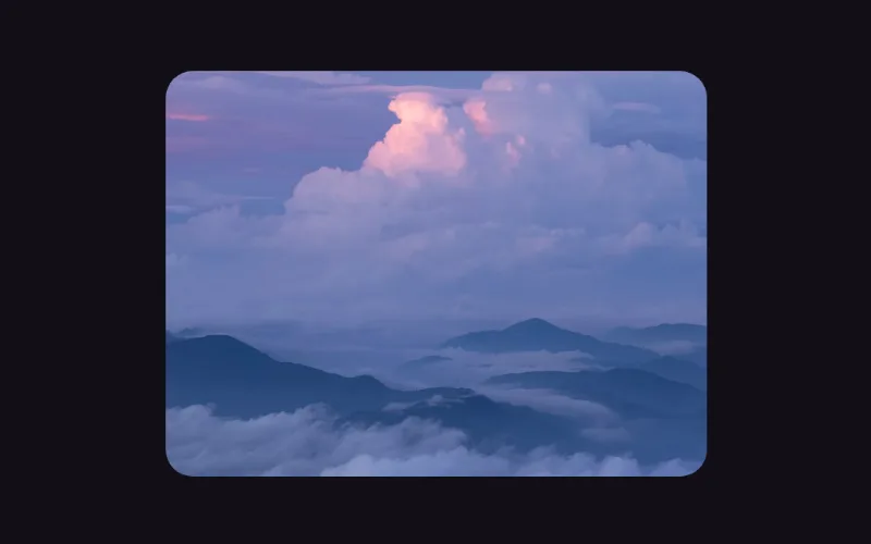
Reserved-aspect frame that walks any media through queued, generating, refining and complete without layout shift: each stage is one blur, saturate, scale and opacity tween, a soft band sweeps while it works, a chip reports the stage, and an error dims the picture behind a retry pill.
 scroll · state — medium
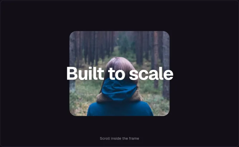
A rounded media frame that grows to full bleed as it scrolls through the viewport.
 loop — expressive
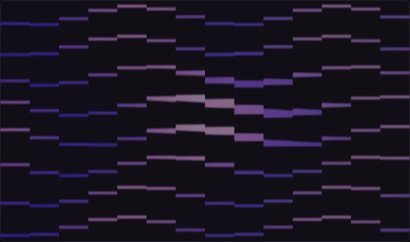 loop · cursor — expressive
A grid of soft glowing bars rippling like a slatted equalizer.
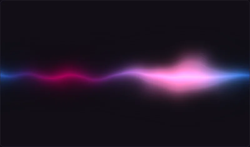 loop · cursor — expressive
Soft aurora borealis shader with 3D Perlin noise and cosine gradient palettes.
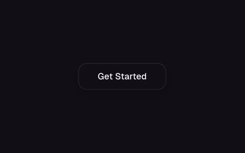 cursor — expressive
Glass button with a shader-driven specular rim light that sweeps around the edge and follows the cursor.
More examples on source sites
These entries have no hosted visual preview. Open the vendor demo to explore them; access requirements still apply.
- beuiExternal demo ↗
- beuiExternal demo ↗
- beuiExternal demo ↗
- beuiExternal demo ↗
- beuiExternal demo ↗
- beuiExternal demo ↗
- beuiExternal demo ↗
- beuiExternal demo ↗
- beuiExternal demo ↗
- smoothuiExternal demo ↗
- smoothuiExternal demo ↗
- smoothuiExternal demo ↗
- smoothuiExternal demo ↗
- transitionsExternal demo ↗
- transitionsExternal demo ↗
- transitionsExternal demo ↗